Spend an afternoon with the identities that won design awards this month and you notice something the trade press keeps underselling. The logos are quiet. The type is loud. The element carrying the brand is no longer a clever mark tucked in a corner, it is the letterforms themselves, drawn or heavily customized, doing the job a symbol used to do alone.
This is not a mood. It is a measurable shift, and June made it concrete. On June 15, Creative Boom published its monthly roundup of new releases and counted ten typefaces worth your attention from a single month of type design. On June 10, DesignRush handed its Best Logo award to a custom serif wordmark. The pattern under both: in 2026, the typeface is the identity, and everything else is set dressing.
Why now, and why so fast? Because the floor just fell out of execution. The variants, the mockups, the resizing that used to eat a studio's week now take an AI agent ninety seconds, a change we wrote about when Figma's agent went live and brand systems became the moat. When execution becomes free and infinite, the only thing left that is hard to fake is a point of view. And type is where a brand's point of view shows up first, on every line, in every word, before anyone clocks the logo.
What actually shipped in type this June?
Look at the June 15 roundup and the releases stop reading like fonts and start reading like systems. Jamie Clarke shipped Reel, a condensed headline face built around a "Flexi-case" mechanism that lets lowercase letters share the full height of the capitals, so a headline can hold a clean rectangular block without stray ascenders breaking the line. Arcane Type Foundry expanded Sahlia Stencil from a single weight into a ten-style family with true italics and a variable font covering every style. Silver Stag released Curo, a super-heavy display sans that ships in five corner treatments, from Sharp to Rounded, which is really five moods in one purchase.
The pattern keeps repeating. Yep! Type put out Unifora, an industrial superfamily with five widths, nine weights, and a variable font spanning weight, width, and slant. Omar Careaga's At Glacier carries over a thousand glyphs and a wall of alternates. Ana Laydner's Drika runs fourteen weights with overlapping forms and emoji baked in. Elena Genova revived 1965 Americana as La Mericana, warm wedge serifs and a fresh italic. None of these are one-note display toys for a poster. Each one is a flexible identity kit shipped as a single file, with the range a brand needs to sound like itself across a billboard, a pricing table, and a push notification.
That is the real story of the month. Type design stopped chasing the perfect neutral workhorse and started shipping personality with a system attached. For a studio, that changes the brief. You are no longer picking a font. You are choosing a voice with built-in registers.
The logo stopped carrying the brand
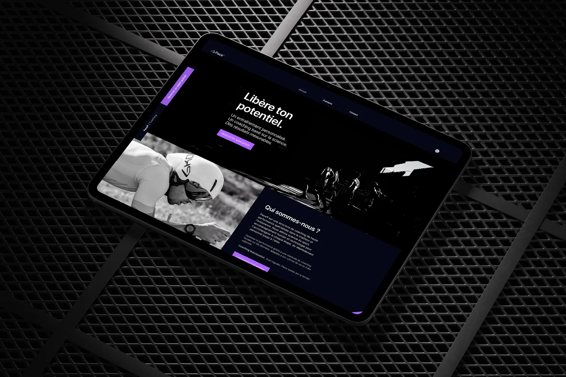
Watch where the big rebrands are spending their money and the center of gravity has clearly moved. Amazon redrew its wordmark in a bespoke face built for screens. BBH, in its first identity overhaul in 44 years, commissioned a contemporary British grotesque and wove its founders' personalities into the letterforms rather than into a symbol. OpenAI's first real rebrand leaned on a new custom typeface to give its interface a recognizable voice. Different companies, different sectors, one identical decision: commission the type, then let the type carry the brand.
The logic is almost boring once you see it. A logo appears once on a screen, usually small, often ignored. The typeface appears in every single word the customer reads. In a world that lives inside interfaces and feeds, the surface a customer actually spends time on is the running text, not the mark. So the mark gets simpler and the type gets richer. The brand's distinctiveness migrates from the thing you see for a second to the thing you read for minutes.
This is the same re-maximalist current we traced when we argued that Spotify's disco ball marked the death of flat design. Flat stripped everything back to a safe minimum, including type. What is replacing it is not noise for its own sake, it is brands deciding that the letterforms are allowed to mean something again. The logo recedes. The type advances. That is the whole move.
Why did safe sans-serifs lose their grip?
For roughly a decade, the default startup identity was a uniform: a geometric sans, a lowercase wordmark, a two-tone palette, a friendly illustration set. It was efficient, it scaled, and it made an entire generation of brands indistinguishable. We called it many things. Most of us privately called it blanding.
The reaction against it is no longer a hunch, it is in the data. Canva's 2026 Design Trends Report, published December 10, 2025, found that searches for "brutalist design," "bold typography," and "type poster" rose 77 percent year over year and generated close to 14 million impressions. DIY-inspired searches climbed 90 percent. Eighty percent of the creators Canva surveyed said 2026 is the year to take back creative control. People are actively hunting for type that feels made by a human with an opinion, not assembled from a dropdown.
This connects to a wider current we covered in our piece on why imperfect design became the biggest trend of 2026. The imperfection wave and the type wave are the same instinct pointed at different surfaces: a rejection of the over-optimized, over-smoothed, machine-default look. When the machine can produce flawless and generic on demand, flawless and generic stops being impressive. Warmth, quirk, and a clear hand become the premium signal. Type is simply the fastest place to deliver that signal, because it touches every word on the page.
Custom type is the cheapest expensive decision a brand makes
A bespoke or customized typeface is a real line on a budget. It can run from a few thousand for a smart customization to a serious five-figure number for a full bespoke family. Founders flinch at it. They should look at it the other way around. It is the single most defensible asset in the whole identity, because it is the one thing an AI agent cannot convincingly fake and a competitor cannot copy without it being obvious to anyone who looks.
That is the through-line from the agent shift. If the brand system is the new moat, the typeface is the deepest part of that moat. An agent can generate a layout, a color pairing, a passable logo in seconds. It cannot generate your typeface, because your typeface is, by definition, the thing that is only yours. Spend on the part that compounds. The palette and the grid are table stakes that any tool now applies blindfolded. The letterforms are the equity.
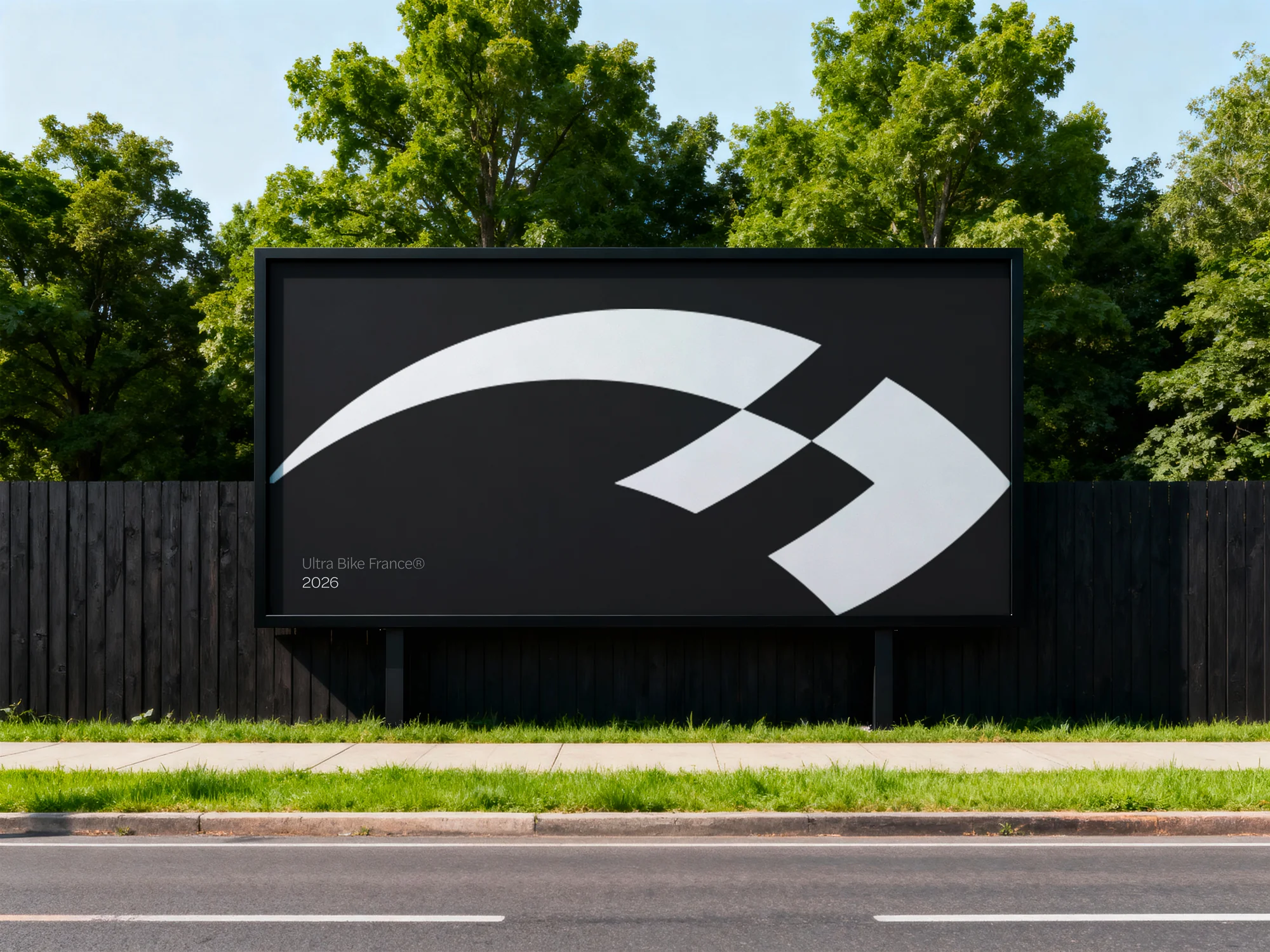
The award results from June 10 make the point in public. DesignRush gave Best Logo to Studio AIO for Balance, a premium food brand whose custom serif wordmark, in their words, "establishes the brand's premium image while maintaining a sense of warmth and accessibility." Best Print went to The Click for Imperial College London's "Creative I" system, a flexible typographic framework holding more than twenty academic departments together while letting each keep its own character. Both winners are type-led systems, not logo-led ones. The mark is not what is doing the work. The typographic structure is.
Is expressive type about to eat itself?
Here is the honest counter-argument, and it has two halves. The first is cultural. When every brand reaches for the same expressive, slightly broken, proudly human type to escape sameness, expressive type becomes the new sameness. We have watched this exact film before. Flat design started as a relief from skeuomorphic clutter and, within three years, became the very uniform people were desperate to escape. Maximal, warm, hand-touched type is on the same clock. The brand that goes loud in 2026 looks brave. The thousandth brand that goes loud in 2028 looks like it bought the same trend pack as everyone else.
The second half is practical, and it is the one studios quietly ignore. Expressive type has a legibility and accessibility cost. A fourteen-weight face with overlapping letterforms and emoji glyphs is a joy on a poster and a problem on a pricing table. Tight contrast, decorative terminals, and ultra-condensed widths can fail real readability and WCAG checks the moment they meet body copy or a form field. There is a performance tax too. A variable font spanning weight, width, and slant is elegant as a concept and heavy as a file, and shipped without subsetting and sensible fallbacks it will quietly drag your largest contentful paint and punish you on mobile.
So the move is not "go maximal everywhere." That is how you end up with a brand that is unreadable and slow and, within two years, indistinguishable from every other studio's mood board. The move is to go distinctive exactly where attention lands, the headline, the wordmark, the hero, and stay disciplined and legible everywhere a human actually has to read or act. Restraint is the part of this trend nobody is selling, which is precisely why it is the part worth buying.
What to commission before your competitors do
If you own a brand, three concrete moves. First, run the swap test. Take your current typeface and mentally replace it with a competitor's. If nobody would notice the difference, you do not have a typeface, you have a default, and a default is exactly what an AI tool reaches for first. That is your gap, and closing it is the highest-leverage design spend available to you right now.
Second, remember that bespoke is not the only door. Full custom type is the premium option, but customization is the smart middle path: license a distinctive family and modify the handful of characters that actually carry the brand, the ampersand, the lowercase "a," the terminals, the way the numerals are drawn. It costs a fraction of a ground-up commission and it is far more ownable than picking the same popular face as everyone in your category. Most brands do not need a new alphabet. They need ten characters that are unmistakably theirs.
Third, brief type as a system, not a pick. Ask for the widths, the weights, an italic with an actual attitude, and the rules for when to go loud and when to recede. That rule set is the difference between a font and an identity. If you want to see how we build that kind of type-led system, our services page walks through the process, and our projects show what the deliverables look like in the wild.
The brands winning attention in 2026 figured out something simple. The logo got you recognized. The type is what people remember reading. Commission the letterforms with the same seriousness you once reserved for the mark, point them at the places attention actually lands, and keep them honest where people have to read. Do that before your category catches on, because the window where distinctive type still feels distinctive is open now, and trends like this one never stay open long.
Sources
- Creative Boom: The best new typefaces for June 2026 (June 15, 2026)
- DesignRush: Names the Six Winners of Its Design Awards for June 2026 (June 10, 2026)
- Canva Newsroom: Imperfect by Design, 2026 Design Trends Report (December 10, 2025)
- It's Nice That: BBH's rebrand, typeface and "zag" glyphs convey its ethos through design (February 26, 2026)
- It's Nice That: The graphic trends you'll want to bookmark for 2026 (January 12, 2026)