Menao® — Brand identity system and digital product design hero

Menao® — Art Direction & Brand Identity

Discipline Art direction — Branding
Date January 2026
Tools Adobe Suite
Industry B2B · Artisan Services
Location France
01

Client

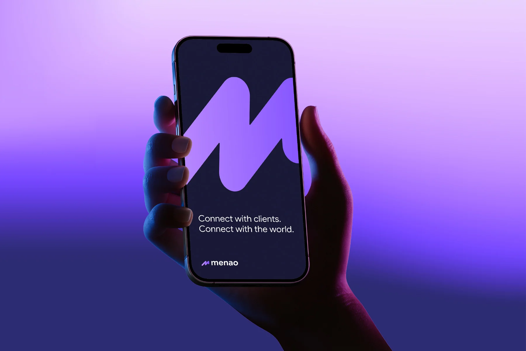
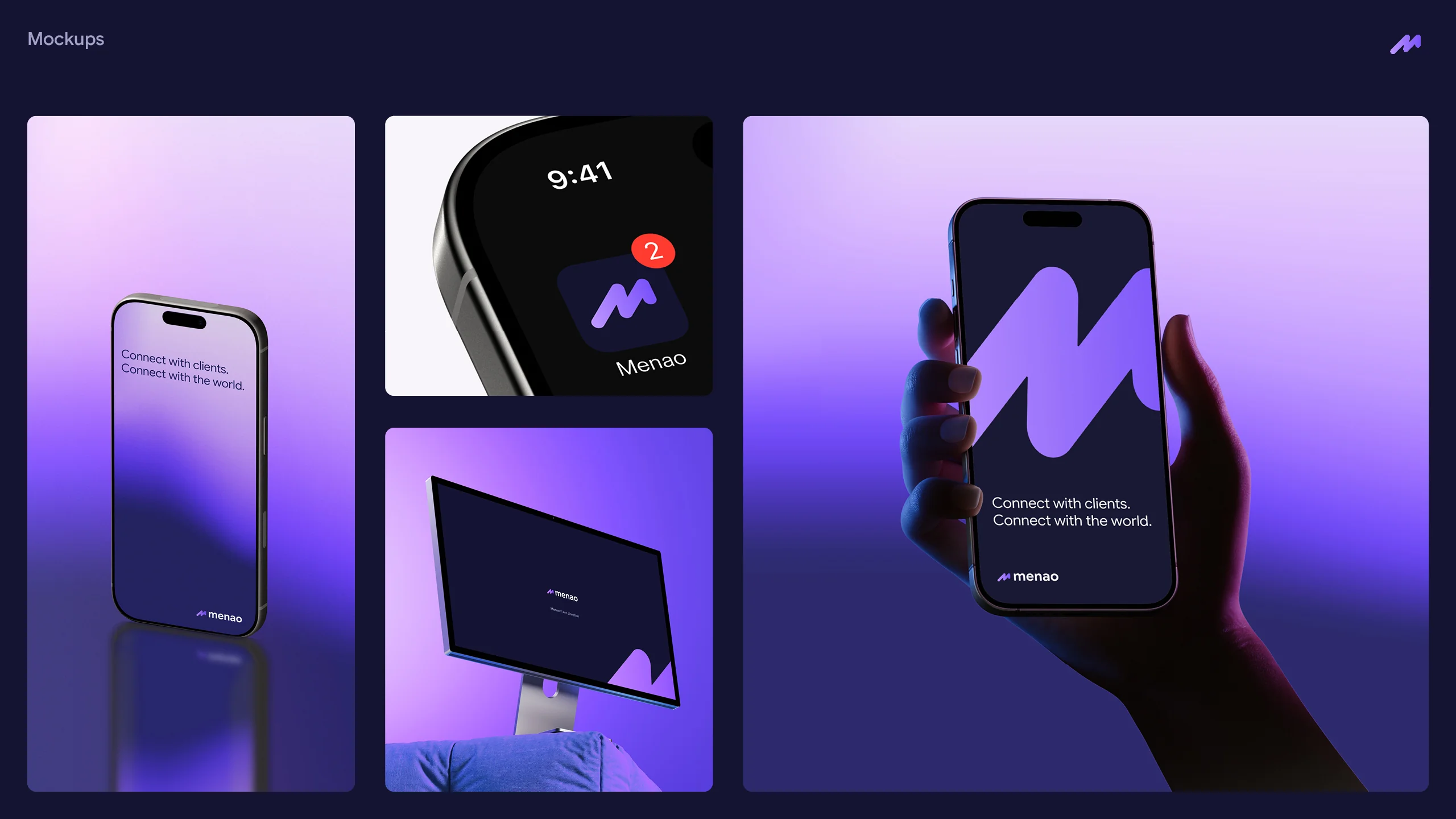
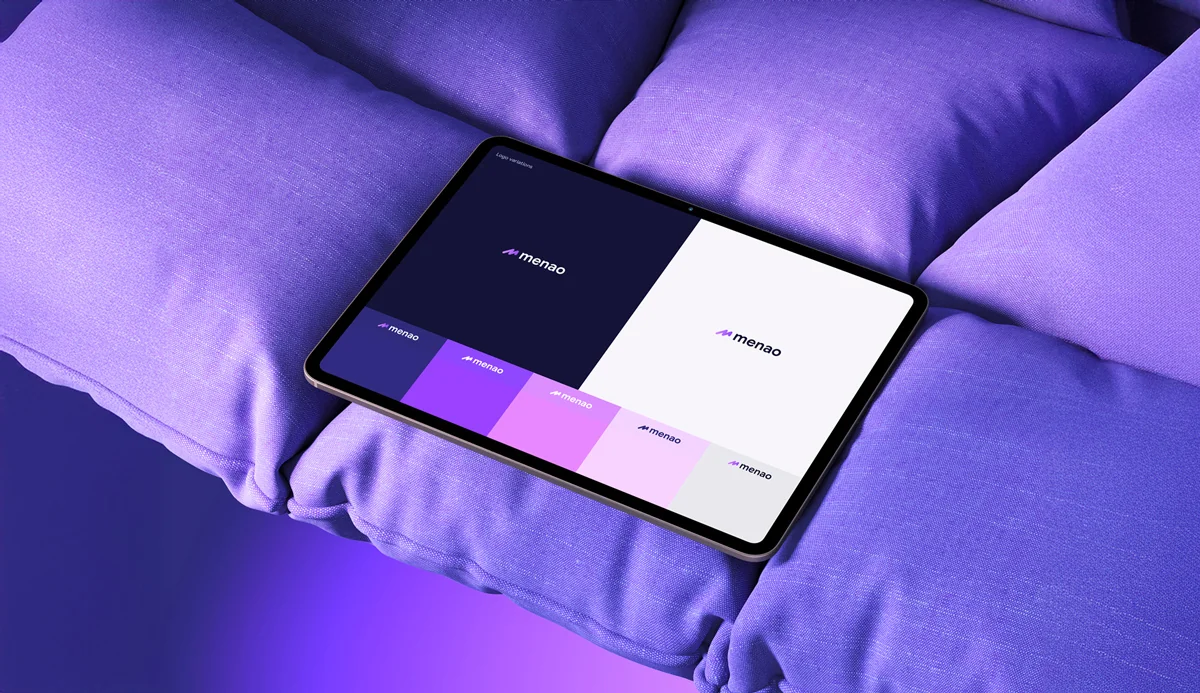
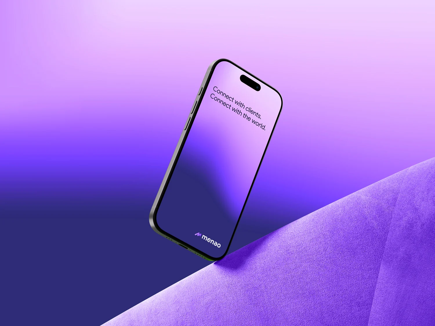
Menao® — B2B platform for artisans, France

Menao® is a digital platform that connects artisans and small businesses with clients through lead generation and workflow tools. Two founders with a clear product vision but no visual identity to build on. They needed a brand before they could brief a UX/UI studio.

02

Challenge

Building brand foundations before product exists

Most B2B platforms look the same — safe blues, generic sans-serifs, stock illustrations. Menao® needed to stand apart while staying credible in a market where trust matters more than personality. The additional challenge: designing an identity system robust enough that a separate UX/UI studio could pick it up and run with it without creative drift.

03

Scope

Art direction & visual identity system

Logo design (monogram + logotype), colour palette, typography selection, icon construction grid, brand guidelines document, visual identity system and art direction rules. Everything packaged as a handoff kit for the product development team.

04

Approach

Design the rules, not the screens

We focused on building a visual system, not designing an app. Every decision — from the purple palette to the grid construction — was made with product scalability in mind. The brand book wasn't just a PDF for investors; it was a working document that the UX/UI team could open on day one and start building from.

[01 — introduction]

A brand foundation built to hand off.

Menao® is a B2B digital platform designed to connect artisans and small businesses with qualified clients through intelligent lead generation and workflow management tools. The founders had a clear product vision and a development roadmap, but no visual identity to anchor it. Before partnering with a UX/UI studio to build the application, they needed a brand system strong enough to guide every product design decision downstream.

My role as art director covered the full brand identity scope: logo design, icon construction, colour palette definition, typography selection and the creation of a comprehensive visual identity system. The deliverable wasn't a set of pretty mockups — it was a working brand toolkit that a development team could open on day one and start building from, with confidence that every screen, every button, every interaction would feel like Menao®.

Menao® — B2B digital platform brand identity overview, art direction and logo design

[02 — icon]

A signature, not a symbol.

The Menao® icon started from a simple idea: the signature. In the artisan world, a signature is a mark of trust between maker and client. It says: this is my work, I stand behind it. The monogram translates that concept into a visual mark that works at every scale — from a 16-pixel favicon to a full-screen splash.

Three principles shaped the design:

Growth — ascending lines suggest upward momentum. Business expansion, workflow efficiency, value creation. Not literal arrows, but a sense of direction embedded in the geometry of the letterform.

Connection — interlocking strokes represent the B2B relationship at the heart of the platform. Artisan meets client, supply meets demand, craft meets technology. The icon itself is a meeting point.

Simplicity — soft curves signal an approachable, mobile-first digital product. The artisan demographic ranges from digitally native to barely comfortable with a smartphone. The brand needed to feel welcoming, not intimidating.

Menao® icon design — signature monogram, brand values and icon construction

[03 — logo construction]

Mathematical precision for digital scalability.

The logo sits on a modular x-based grid that governs the relationship between monogram and logotype. This isn't a decorative exercise — it's a construction tool. When a UX/UI team inherits a brand, the first thing they need is clear proportional rules. How much clearspace around the icon? What's the minimum size before the monogram becomes illegible? How does the logotype scale relative to the icon? The grid answers all of these questions before anyone has to ask.

Every proportion is mathematically defined, which means the logo renders predictably across every screen density and viewport. From a 16px favicon to a retina display header, the geometry holds. No optical adjustments needed at different sizes, no alternative versions for small screens. One logo system that works everywhere.

For a mobile application brand, this level of precision matters more than it does for a restaurant or a fashion label. Digital products live at dozens of sizes simultaneously — notification badges, tab bars, loading screens, email signatures, app store listings: the grid ensures the logo looks intentional in every context.

Menao® logo construction — modular x-based grid and proportional system for digital scalability

Looking to build your brand identity?

Start a project

[04 — typography & colour]

Typography that performs on screen. Colour that stands apart.

Google Sans was chosen for one practical reason: it's built for digital interfaces. Clean geometry, balanced proportions, strong readability across mobile and desktop at every size. For a B2B product that lives entirely on screen — no print, no packaging, no physical touchpoints — the typography has to work harder than it does for most brands. It carries the entire reading experience. Google Sans handles that without compromising the modern, professional tone Menao® needs to build trust with artisans who are putting their livelihood on a platform.

The colour palette was a strategic decision as much as an aesthetic one. The B2B SaaS market is dominated by blues — Salesforce, HubSpot, LinkedIn, Stripe. Purple gave Menao® immediate visual differentiation while retaining the technological credibility the category demands. It reads as modern and innovative without feeling experimental or risky — critical for a platform asking artisans to trust it with their business operations.

Off-white and violet black provide the neutral foundations. The extended palette includes gradient shades of purple and pink that give the UX/UI team enough chromatic range to build a complete interface — buttons, alerts, data visualisations, status indicators — without leaving the brand territory. Every colour was tested for WCAG AA accessibility compliance, because a platform serving artisans of all ages and digital literacy levels can't afford contrast failures.

Stand out in a sea of blue SaaS.

Purple with purpose.

[brand guidelines]

01 / 10
Menao® brand guidelines — visual identity system overview
Menao® brand guidelines — logo usage rules and clearspace
Menao® brand guidelines — colour palette and design tokens
Menao® brand guidelines — typography system and hierarchy
Menao® brand guidelines — iconography and UI component library
Menao® brand guidelines — digital product mockup and application
Menao® brand guidelines — brand application on stationery
Menao® brand guidelines — social media templates and brand voice
Menao® brand guidelines — mobile app brand application
Menao® brand guidelines — scalable brand system and governance rules

[05 — brand system]

Design the rules, not the screens.

A brand identity for a mobile application is fundamentally different from branding a restaurant or a product line. There are no physical touchpoints to design for — no signage, no packaging, no menus. Everything lives on a screen, and that screen is usually 375 pixels wide. The visual system needs to work within the constraints of mobile UI while still carrying enough personality to be memorable.

For Menao®, the brand system was designed as a handoff document first and a presentation piece second. Every page of the brand guidelines answers a question a developer or product designer might ask: What spacing should I use around the logo? Which purple is for interactive elements and which is for decorative? How does the typography scale from mobile to desktop? What does an error state look like within the brand language?

The visual identity extends beyond the logo and palette into a set of principles that govern composition, hierarchy, spacing and interaction patterns. These aren't wireframes or UI mockups — that's the UX/UI studio's job. They're brand-level rules that ensure the product feels like Menao® regardless of which team builds it, which framework they choose, or which features get prioritised in the first release.

This approach — designing brand architecture before product architecture — is becoming standard practice for early-stage SaaS startups. It's more efficient than trying to retrofit a brand onto a product that's already been built. The founders of Menao® understood this: invest in the identity early, and every subsequent design decision becomes faster and more coherent.

Menao® — brand system applications, visual identity across digital touchpoints

[conclusion]

A brand ready for product development.

The art direction gave Menao® a visual system that's ready to scale. Logo, colours, typography, guidelines, everything the UX/UI studio needs to build an application that looks and feels like the brand from the first wireframe to the production release.

Menao® — brand identity hero visual, art direction for B2B platform
Menao® — colour system detail, purple palette for SaaS branding
Menao® — modular grid brand application, logo construction
Menao® — digital product brand application, mobile app identity
Menao® — brand touchpoint application, visual identity system
Menao® — scalable brand system, artisan platform visual language
Menao® — final brand visual, complete art direction for B2B digital platform

Ready to start your branding project?

Book a free call

[more branding projects]

(06)

Have a project?

Get in touch using the form below.

By submitting this form, you consent to your data being used to respond to your message.