Pyrene® — brand identity system hero image

Pyrene® — Sports Nutrition Branding, Packaging & Art Direction

Discipline Art direction — Branding — Web
Date Oct 2024 — present
Tools Adobe Suite — Shopify
Industry Sports Nutrition · Endurance & Ultra-Endurance
Location Toulouse, France → Worldwide
01

Client

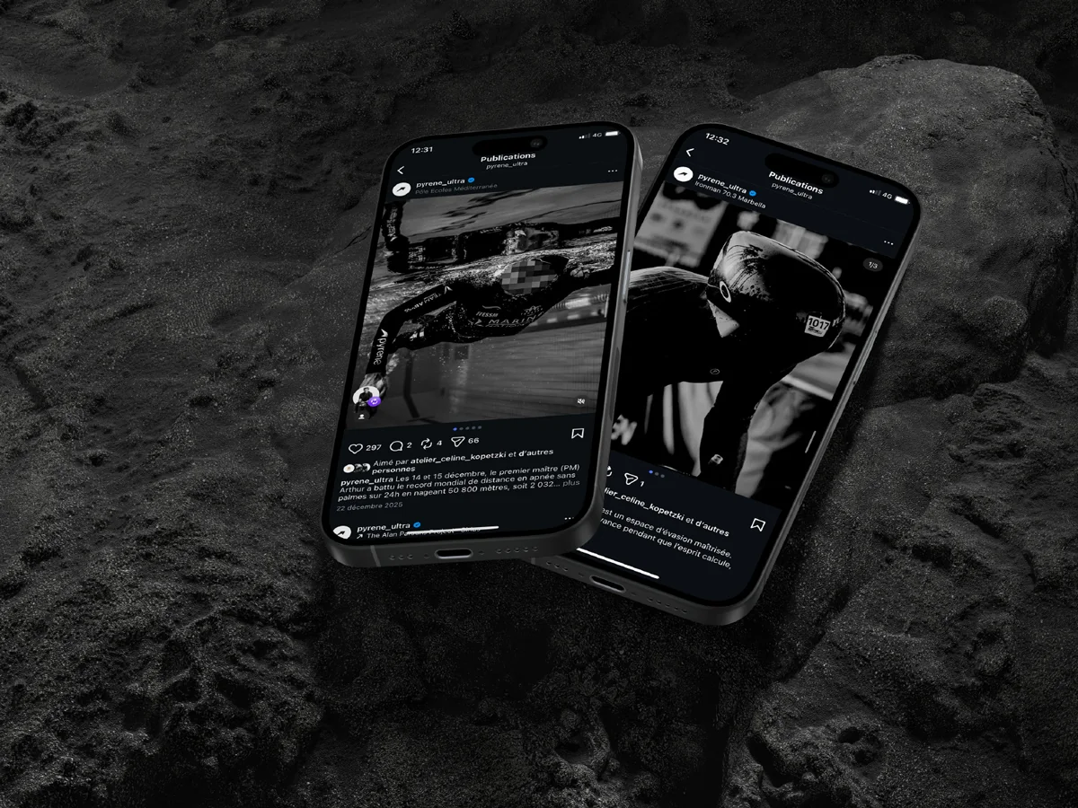
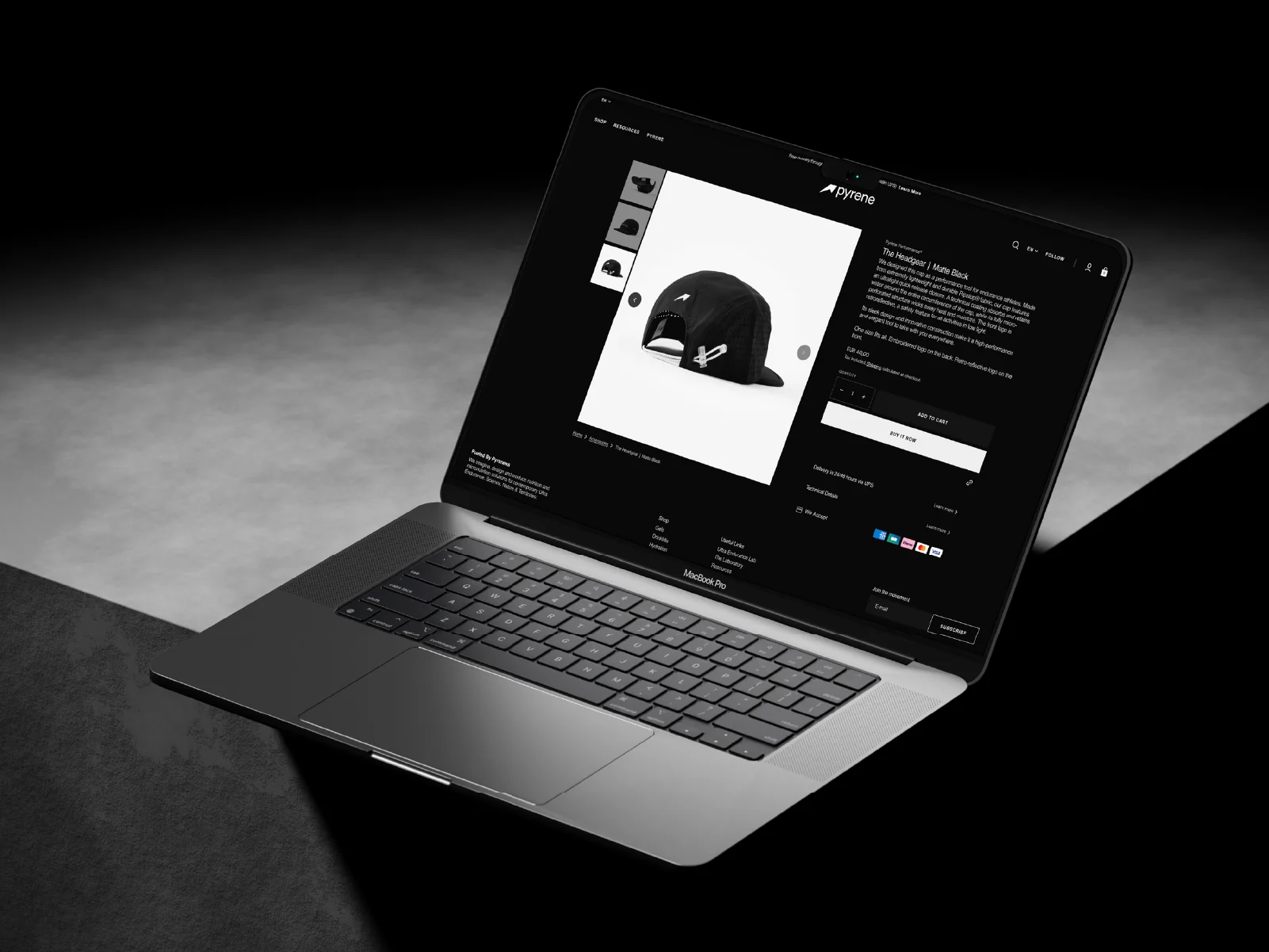
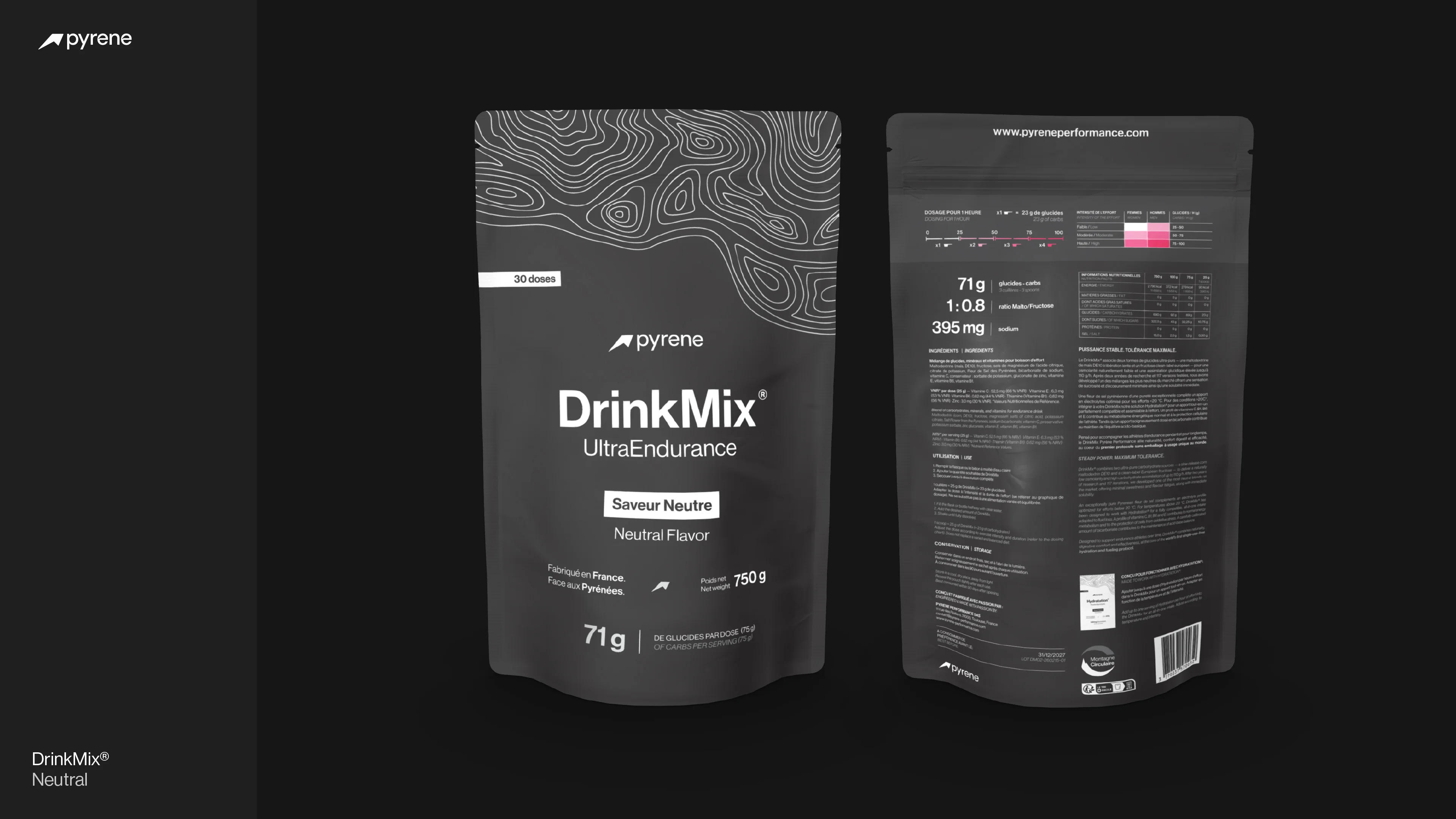
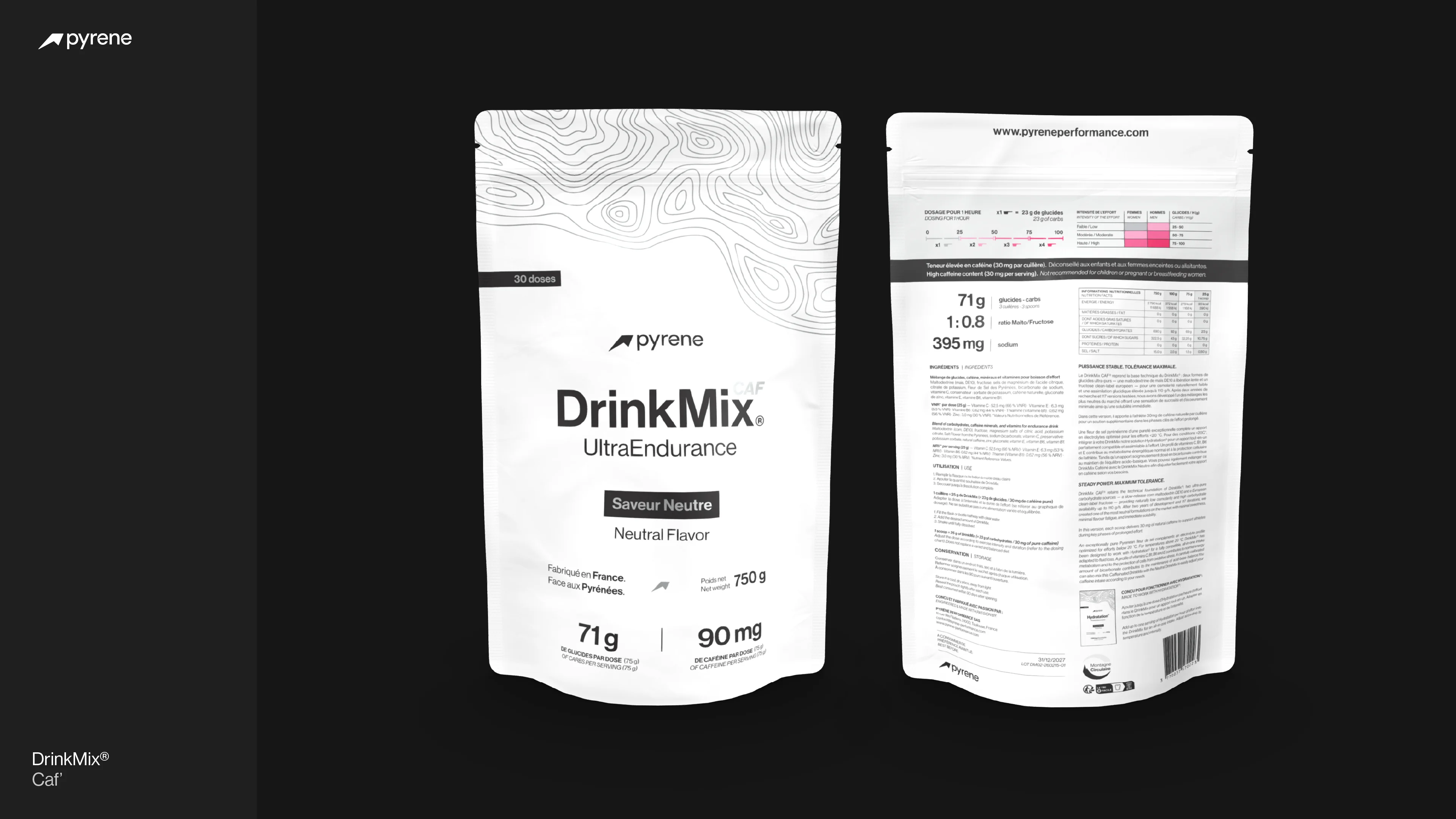
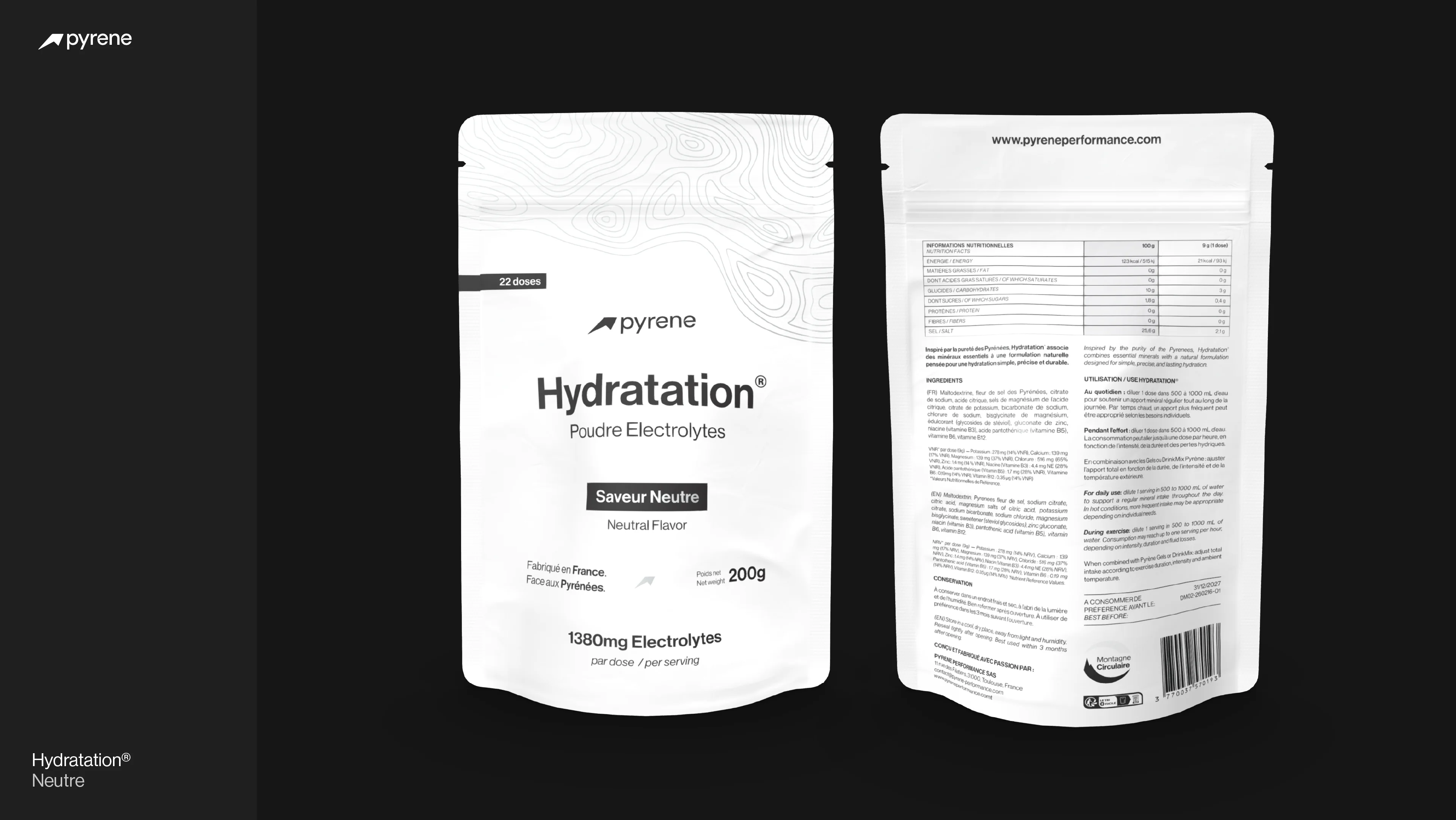
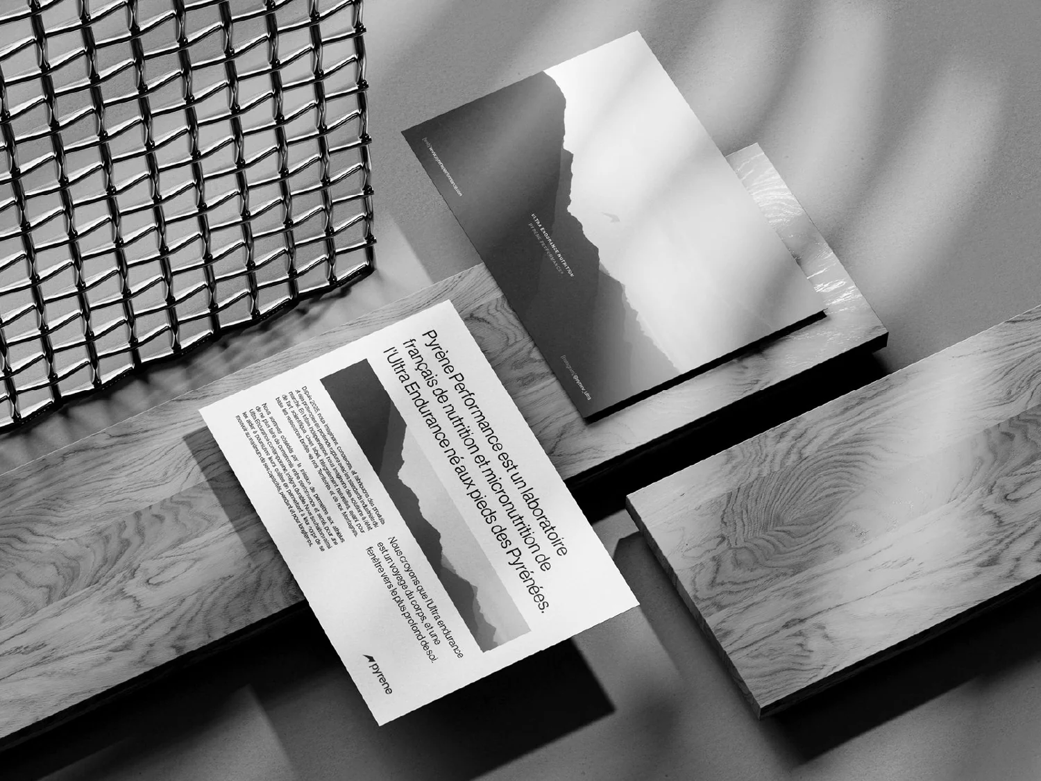
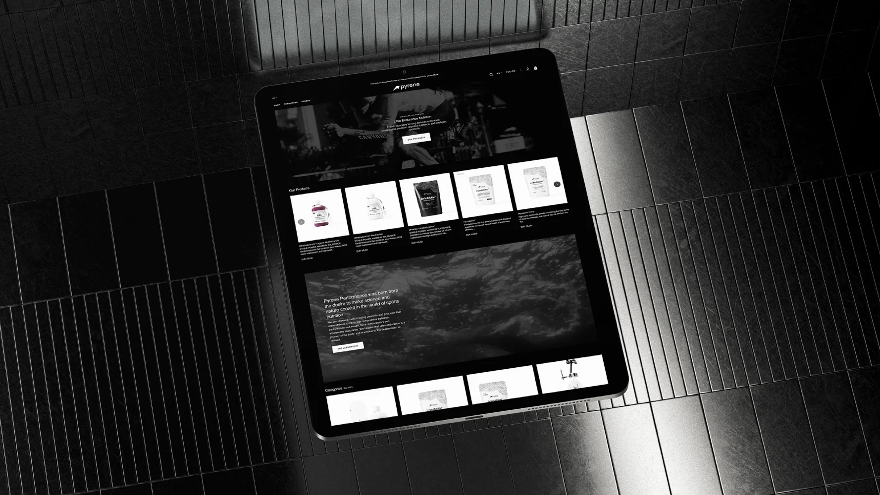
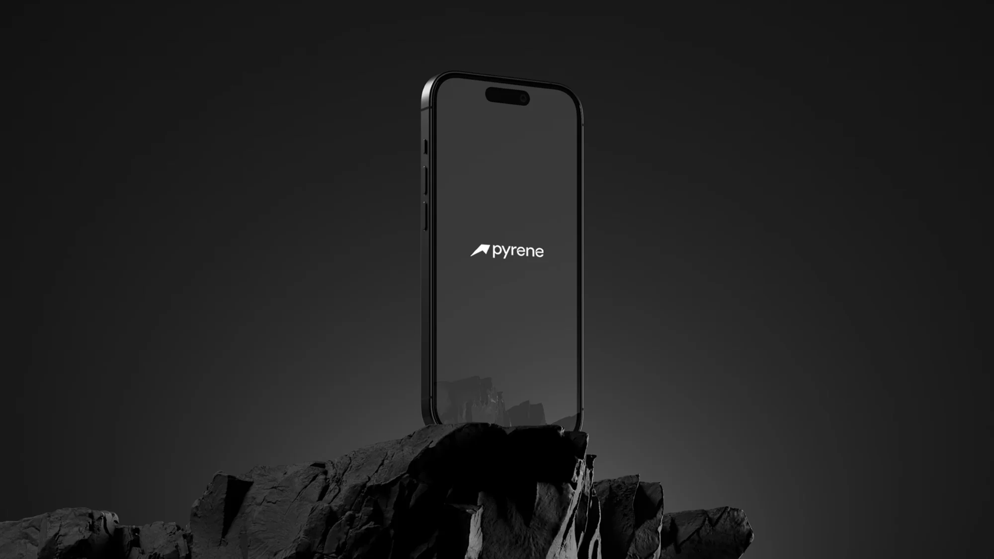
Pyrene Performance® — Toulouse, France

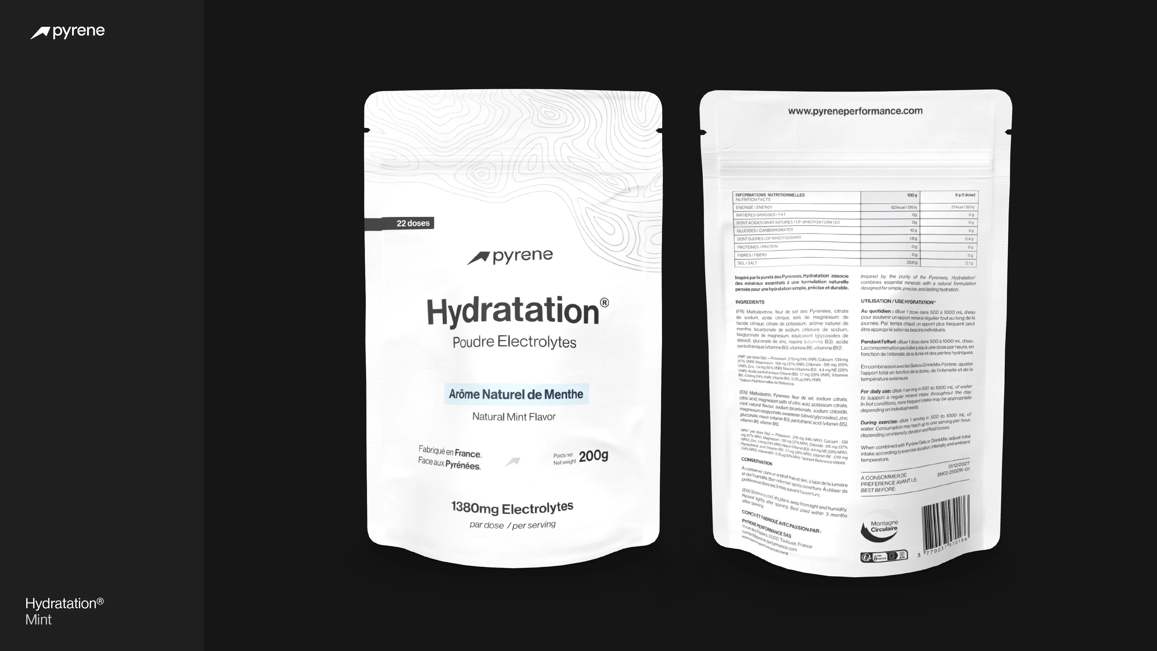
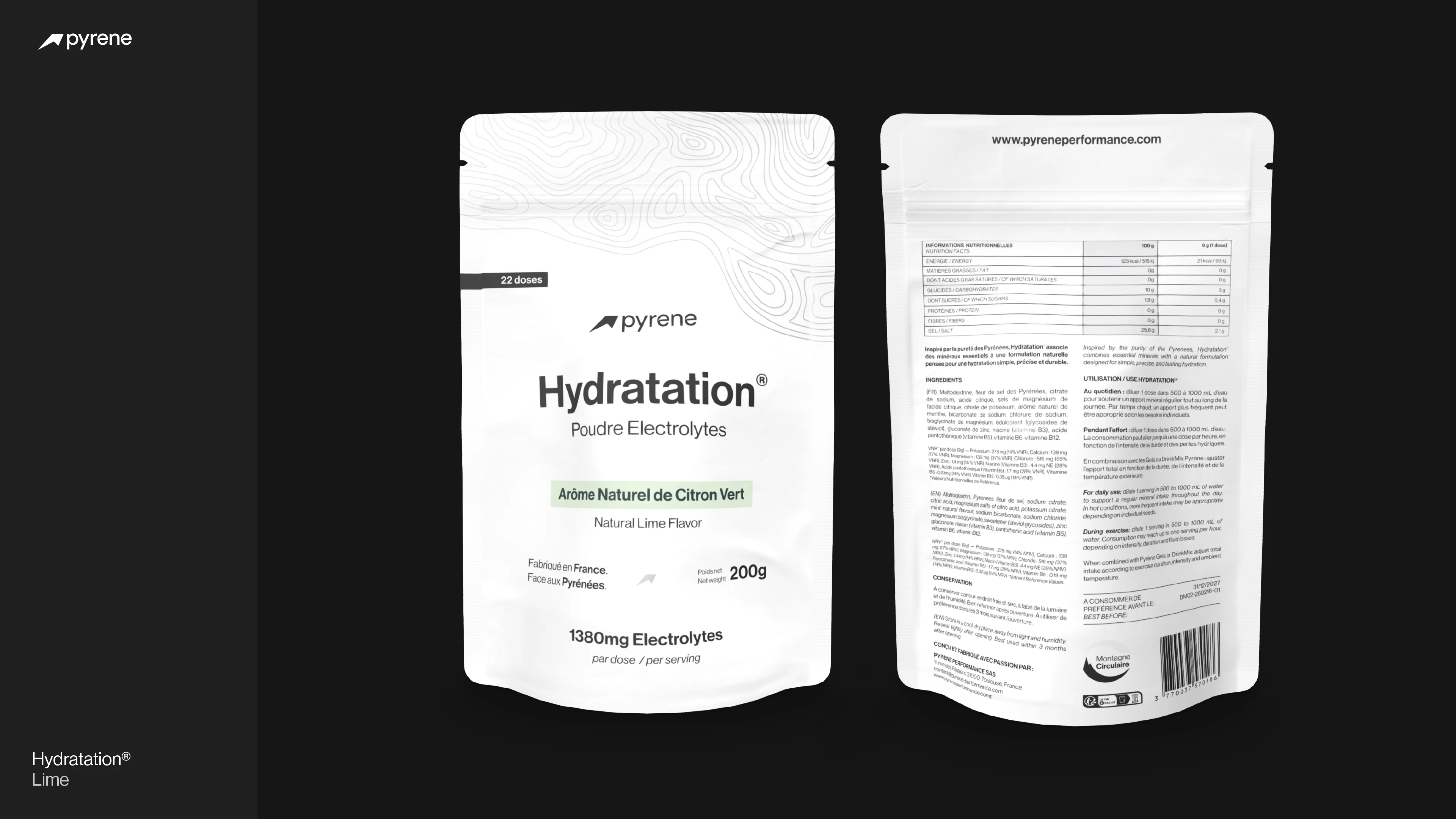
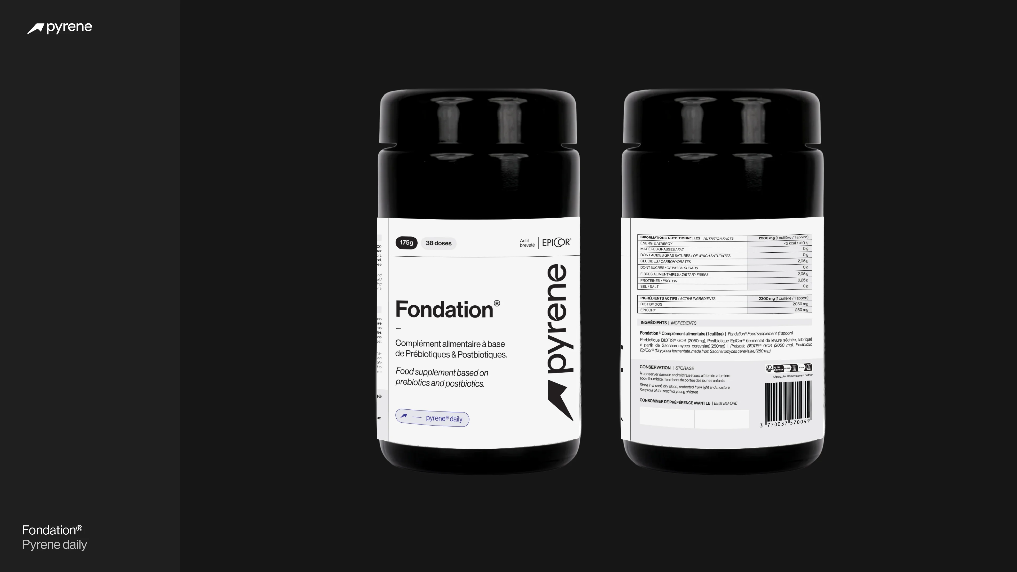
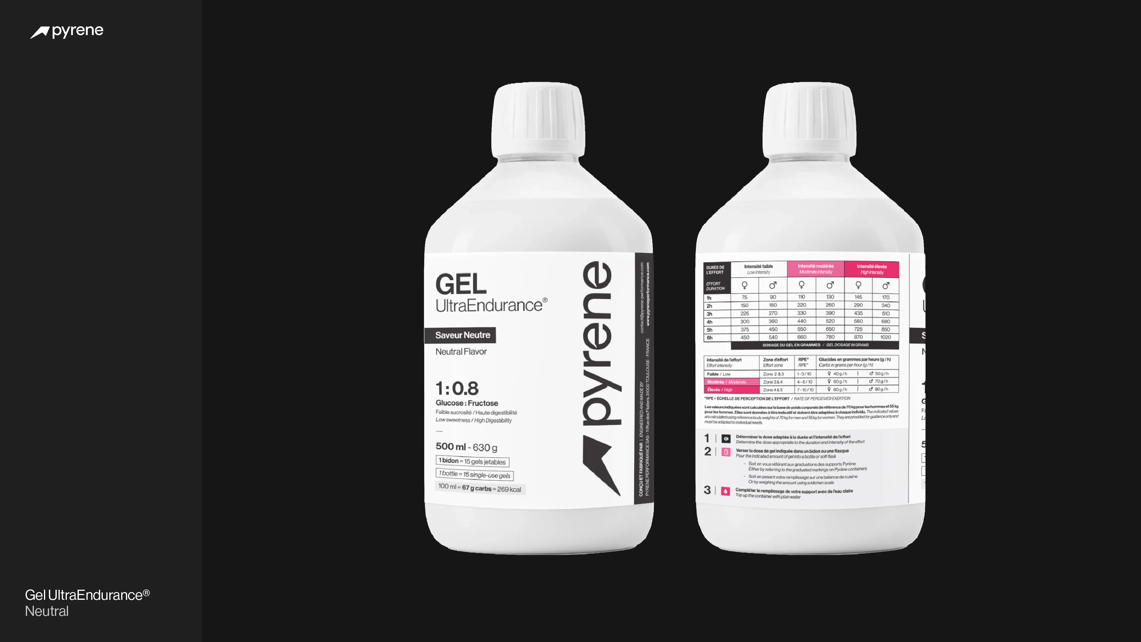
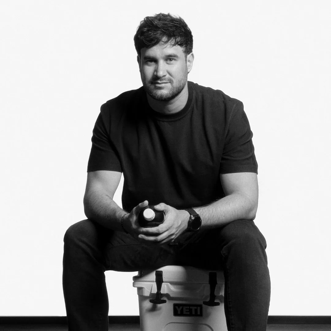
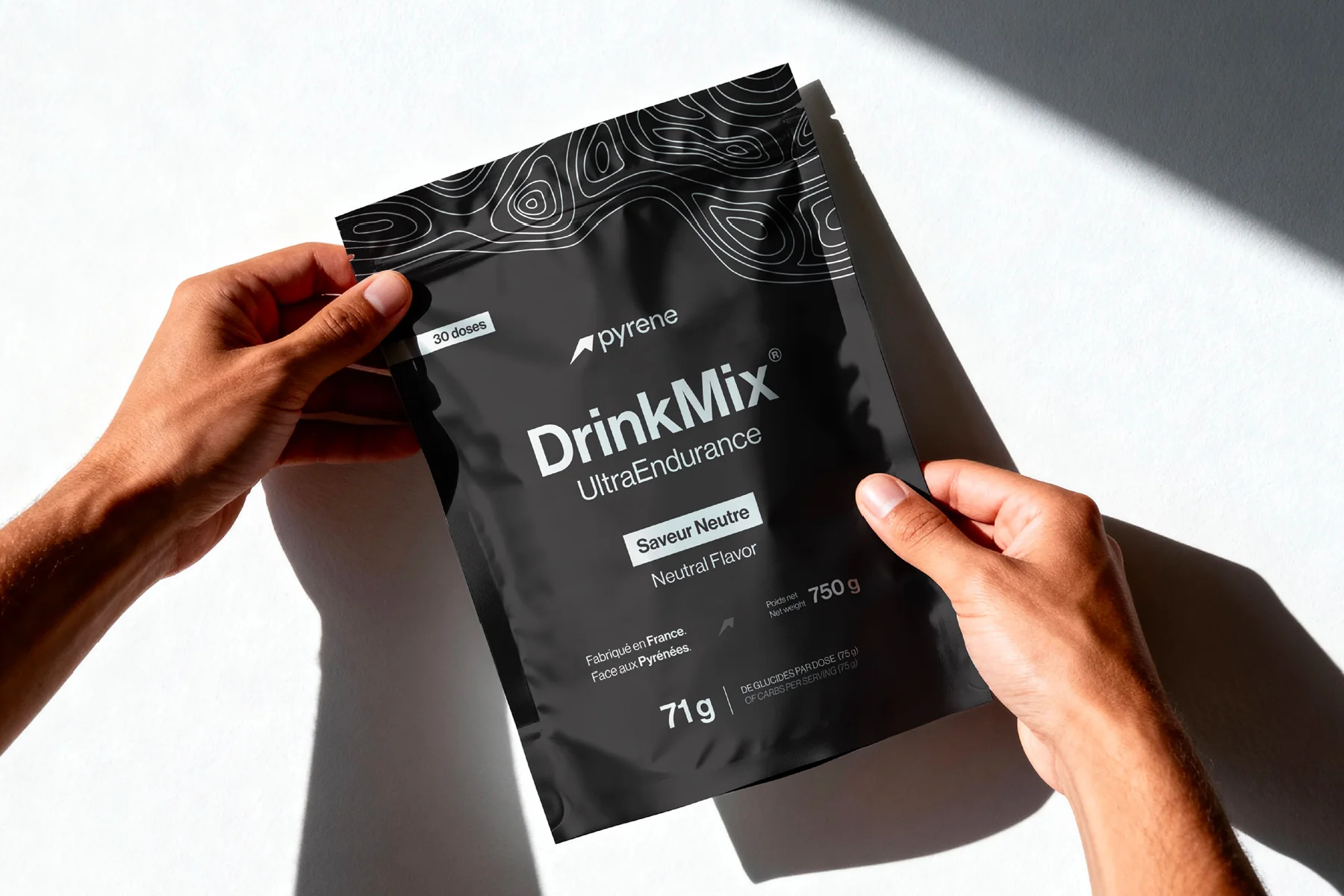
Florian and Emmanuel, two friends from Toulouse, lifelong athletes. Running, cycling, adventure racing. Frustrated by products that were poorly tolerated, with opaque ingredient lists, they decided to build their own. Pyrene Performance was born from that demand: a French sports nutrition brand rooted in the Pyrenees, refusing to sacrifice science and athlete health for the sake of marketing.

02

Challenge

Zero brand equity in a crowded market

Maurten, SiS, Näak, Tailwind. The market is packed with brands that have built trust over years. Pyrene was starting from zero. The challenge: show up on day one with the stature of an established brand. Premium, credible, athlete-driven. A visual language that earns trust at first glance, whether on a shelf, on a start line, or under a headlamp at 3am mid-race.

03

Scope

Everything, from scratch

Far more than a logo. This was about building an entire brand from nothing. Strategy, positioning, visual identity, packaging for the full product range, e-commerce on Shopify, marketing campaigns, social media, photography, motion. A creative partnership that's still running today.

04

Approach

Science meets altitude

One tension drove every creative decision: the raw, untamed power of the Pyrenees meets the clinical precision of sports science. The brand had to feel wild and measured at the same time. We immersed ourselves in the ultra-endurance world — the visual codes, the community, the rituals — and built a system that speaks to athletes who know endurance isn't about brute force. It's about intelligent preparation.

[01 — brand strategy & vision]

Art direction in service of tomorrow's endurance.

Pyrene came to us as a conviction and a blank page. Two founders who knew exactly what their products should do and how they should make athletes feel. Everything else had to be built.

Our goal: build a visual identity capable of standing alongside the biggest names in endurance nutrition.

Pyrene® — brand overview

[02 — icon design & golden ratio]

The Pyrene icon was designed on the golden ratio and the Fibonacci spiral — two timeless mathematical references that underpin visual harmony in nature and art.

The icon tells the story, identity and promise of the brand:

1. The letter P from Pyrene®.

2. The triangular shapes of the Pyrenees mountains.

3. The silhouette of an athlete taking off.

Pyrene® logo construction

[03 — logo construction & typographic system]

The icon and typography are structured according to a proportional scaling system derived from the icon's height (x = 1 on the 1:1.618 golden ratio), modelled by a set of linear equations. Variables x, y, z, a, and b determine spacing and proportions, while the total wordmark width follows 3x+z+a and letter-spacing is governed by a+b+2x+a.

Pyrene® logo construction

[04 — brand storytelling & mythology]

To perfect the logo's construction, we must look to the legend of Pyrene. The story tells that the young woman, in love with Hercules, succumbed to grief and exhaustion when the hero left to fulfil his destiny. Hercules built a stone tomb with his own hands to the scale of his sorrow, giving birth to the Pyrenees, the timeless guardians of this love.

The stylised "tears" at the heart of the "e"s in Pyrene® perpetuate the memory of this myth. From a technical standpoint, these incisions act as ink-traps, a typographic technique that anticipates ink bleed during small-scale printing, ensuring perfect legibility while paying tribute to the heritage of the calligraphic gesture.

Pyrene® logo — ink-trap detail

Not another supplement brand.

A science-first laboratory.

[brand applications]

01 / 07
Pyrene® brand colour palette and typography system on dark background
Pyrene® logo lockup variations — horizontal and stacked versions
Pyrene® brand guidelines spread — spacing rules and clear space
Pyrene® business card design — front and back with embossed logo
Pyrene® brand application — merchandise and apparel mockup
Pyrene® iconography system — custom icons for endurance sports
Pyrene® brand pattern — geometric mountain motif for packaging and digital

Looking to build your brand identity system?

Start a project

[05 — packaging design & sustainability]

The packaging system extends the same principles of clarity, proportion and balance across the entire Pyrene® catalogue of 13 SKUs: five Gel UltraEndurance® flavours (Neutre, Caf, Myrtille Bio des Pyrénées, Miel Bio des Pyrénées, Fleur d'Oranger), three Hydratation formulas (Neutre, Menthe, Citron Vert), two DrinkMix blends (Neutre, Caf) and three Fondation UltraFlask bottles (250ml, 500ml, 700ml). Each product carries a laboratory-grade visual language.

[packaging system]

01 / 12
Pyrene® Gel UltraEndurance Myrtille Bio — front packaging design
Pyrene® Gel UltraEndurance Neutre — front packaging design
Pyrene® DrinkMix UltraEndurance — packaging with nutrition facts
Pyrene® product range — three gels side by side on white background
Pyrene® Flask 350ml reusable — debossed logo detail
Pyrene® packaging system — label grid and information hierarchy
Pyrene® gel sachets — race-day table mockup with athlete hands
Pyrene® multi-pack box design — top and side view
Pyrene® packaging — ingredient transparency panel closeup
Pyrene® product photography — studio lighting on dark backdrop
Pyrene® packaging ecosystem — full range displayed together
Pyrene® shipping box and unboxing experience design

No compromise.

Engineered for Endurance.

[06 — digital ecosystem & e-commerce]

The social media art direction follows the same strategic logic: a deliberate balance of performance mindset, scientific depth, product education and athlete stories. Content pillars include race-day protocol visuals, ingredient deep-dives, behind-the-scenes formulation content and user-generated athlete photography. Templates were designed for consistency at scale — the founding team can publish on-brand content autonomously without design support for every post.

The Instagram presence (@pyrene_lab) and YouTube channel serve as the brand's primary community touchpoints, with content calibrated for the ultra-endurance audience: detailed, authentic, never superficial.

[social media]

01 / 17
Pyrene® Instagram post — product launch announcement with mountain backdrop
Pyrene® Instagram carousel — ultra-trail race nutrition protocol
Pyrene® Instagram post — Gel UltraEndurance Myrtille product spotlight
Pyrene® Instagram story — behind the scenes formulation lab
Pyrene® Instagram post — athlete testimonial during ultra-cycling event
Pyrene® Instagram carousel — brand values and mission statement
Pyrene® Instagram post — Pyrenees mountain landscape brand photography
Pyrene® Instagram post — DrinkMix product education infographic
Pyrene® Instagram reel cover — race day preparation content
Pyrene® Instagram post — Flask 350ml reusable product highlight
Pyrene® Instagram carousel — endurance nutrition science deep-dive
Pyrene® Instagram post — community athlete feature on trail
Pyrene® Instagram post — ingredient sourcing and transparency
Pyrene® Instagram story template — race results and performance data
Pyrene® Instagram post — seasonal content winter training edition
Pyrene® Instagram carousel — packaging unboxing and product overview
Pyrene® Instagram post — brand partnership and event sponsorship

From zero to shelves in 6 months.

One brand. Fueled by the Pyrenees.

0 Product SKUs launched
0 European countries served
0 Months from brief to shelf
0 Instagram followers

We build timeless brands in a matter of weeks.

Start a project

[conclusion]

Pyrene® started as a blank page and two founders with a clear vision. Six months later, the brand was on shelves, online across 24 countries, and growing a community of athletes who trust what they see as much as what they consume. Every touchpoint was built as part of the same system — building consistency, trust, and a visual identity as uncompromising as the ambitions behind it. A philosophy we carry into every project, whether it's endurance nutrition, a triathlon coaching brand in Toulouse, an ultra-cycling event series across France or a boutique guest house by the sea.

Pyrene® brand identity hero — full visual system on dark background
Pyrene® typography detail — custom letterforms with ink-trap cuts
Pyrene® colour system — primary palette indigo black white teal
Pyrene® packaging lineup — complete product range photography
Pyrene® environmental mockup — brand signage at ultra-endurance event
Pyrene® digital ecosystem — website and social media on devices
Pyrene® final brand visual — identity system complete overview

[what the founders say]

Florian Billard

Florian B.

Co-founder — Pyrene Performance

"Working with Richard was decisive for the birth of Pyrene. His ability to translate a sporting and scientific vision into a strong, coherent, and lasting identity far exceeded our expectations."

Emmanuel Lamare

Emmanuel L.

Co-founder — Pyrene Performance

"The strategic approach and attention to detail brought to the branding and digital experience allowed Pyrene to immediately position itself as a premium brand."

[more branding projects]

(06)

Start your branding project — Get a free consultation from our Paris design studio

Tell me about it — I'll get back to you within 24 hours with a free intro call proposal.

By submitting this form, you consent to your data being used to respond to your message.

Not ready yet?

Browse more projects ↑