Pace® — brand identity and art direction for triathlon coaching hero

Pace® — Sports Coaching Branding, Art Direction & Web Design

Discipline Art direction · Branding · Web design
Date April 2025 · present
Tools Adobe Suite · Framer
Industry Sports Coaching · Triathlon & Endurance
Location Toulouse, Occitanie
01

Client

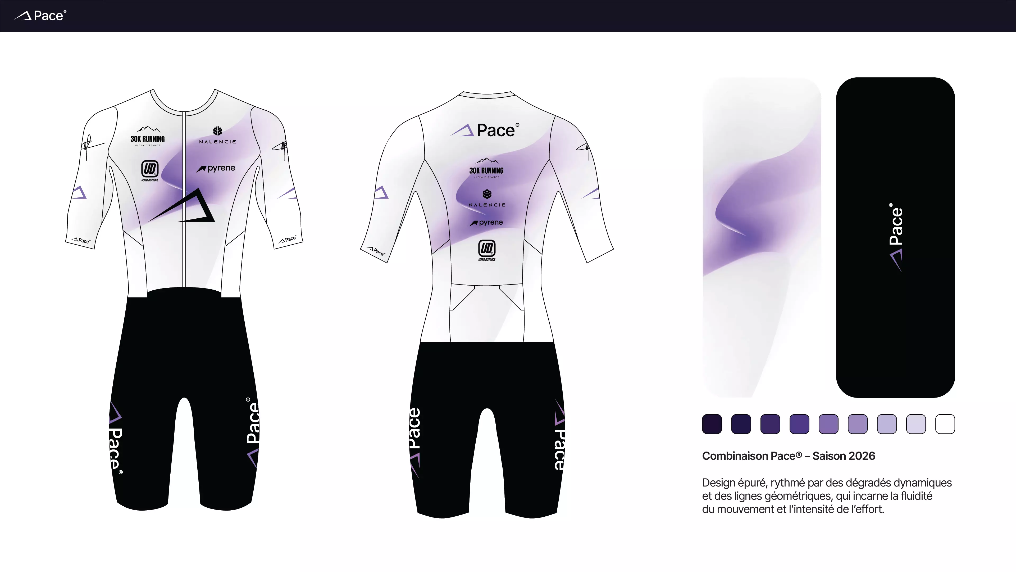
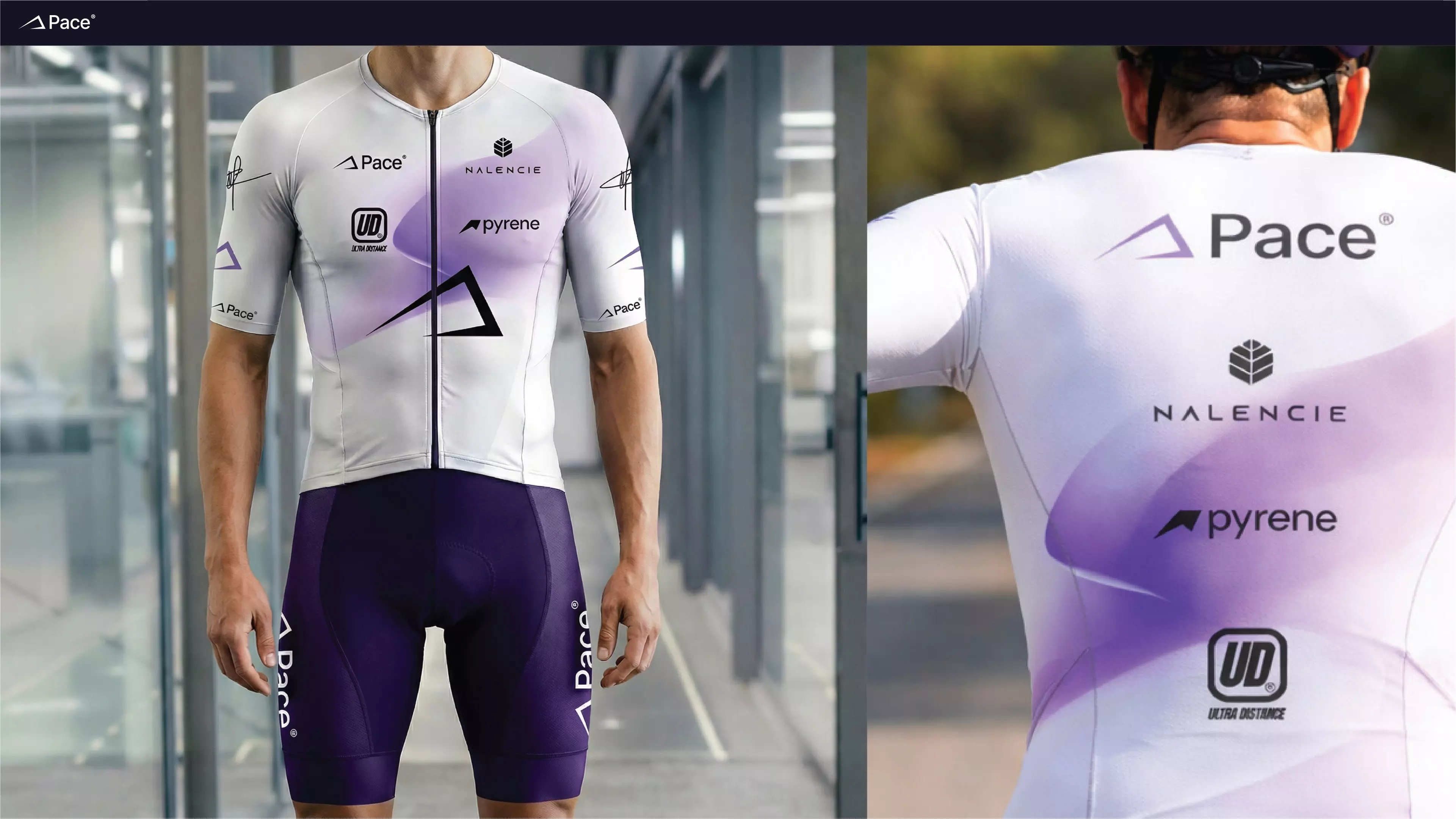
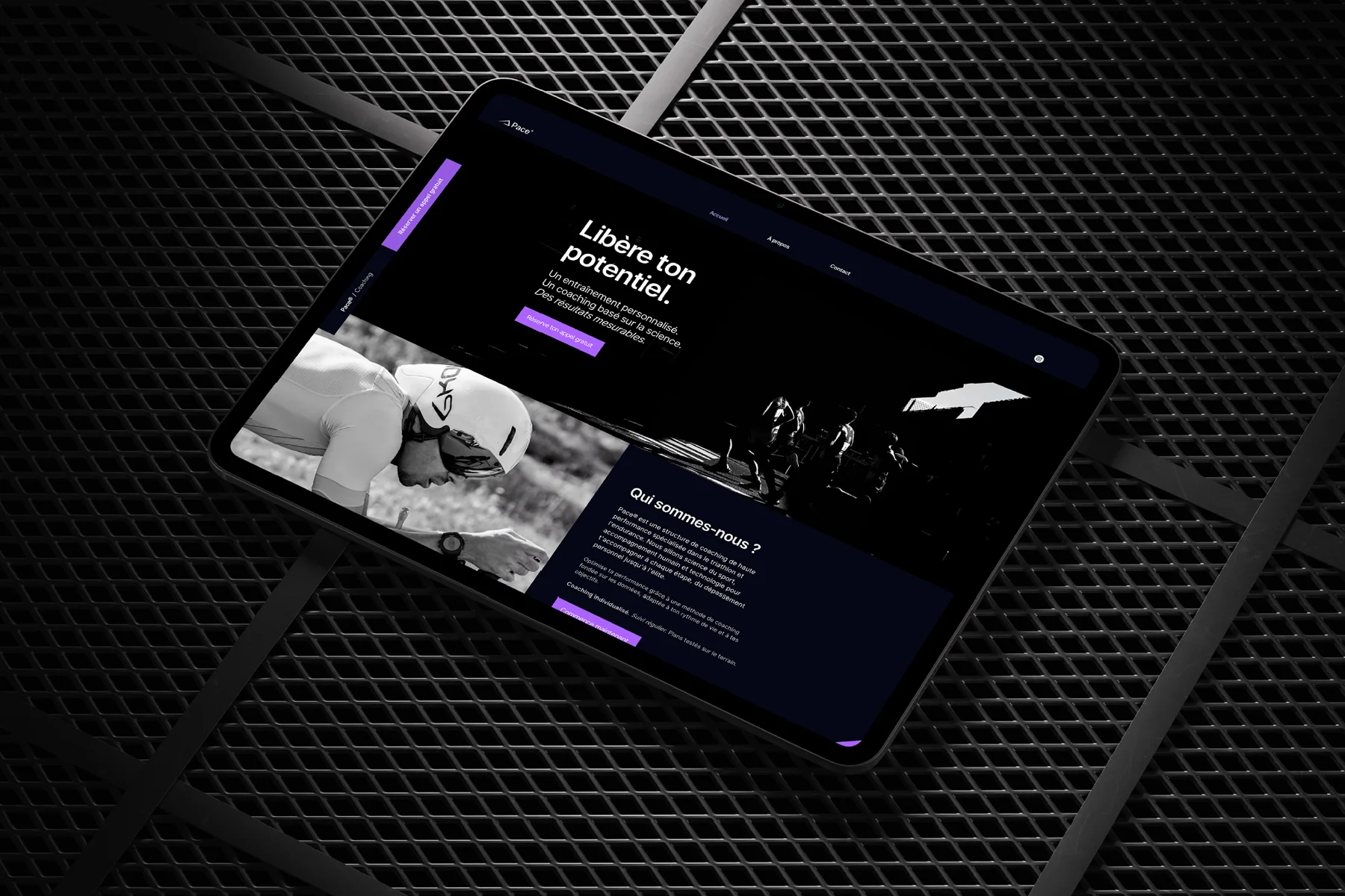
Pace® — Toulouse, Occitanie

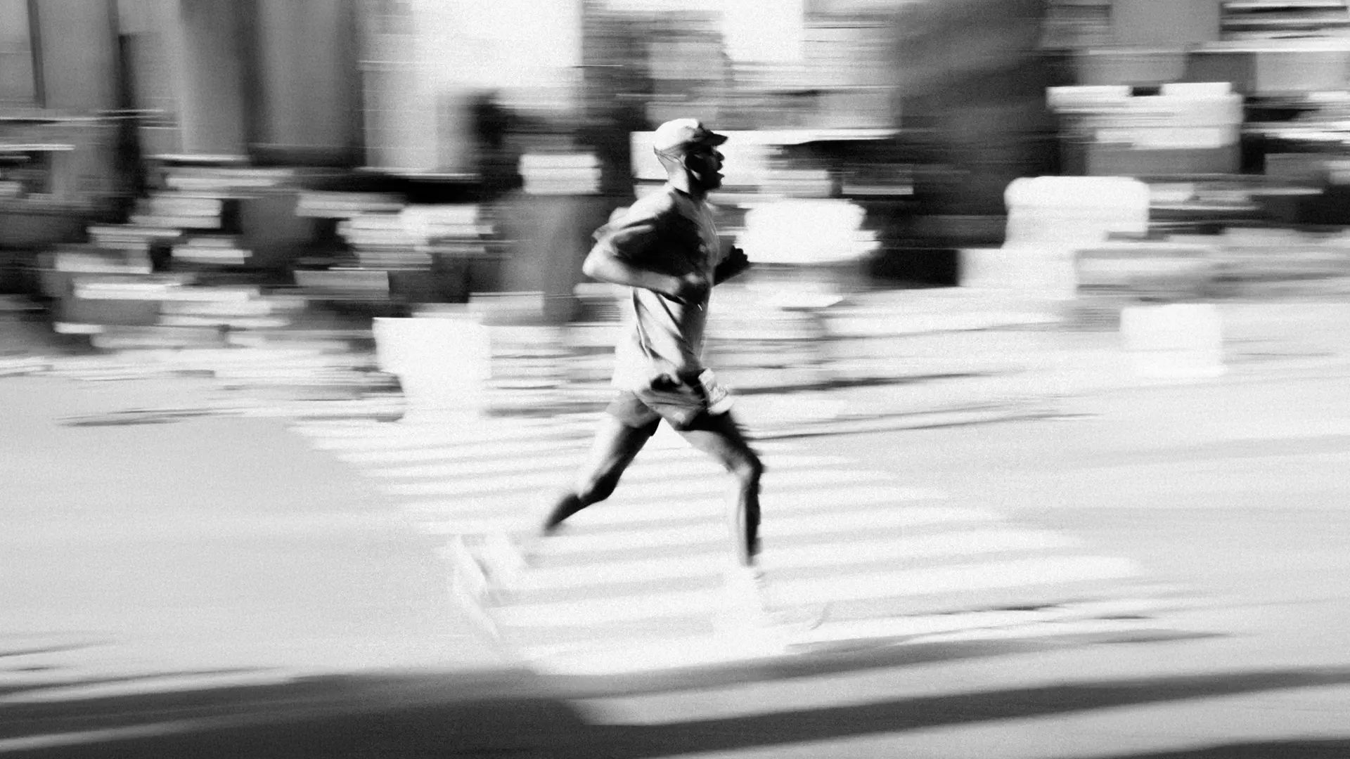
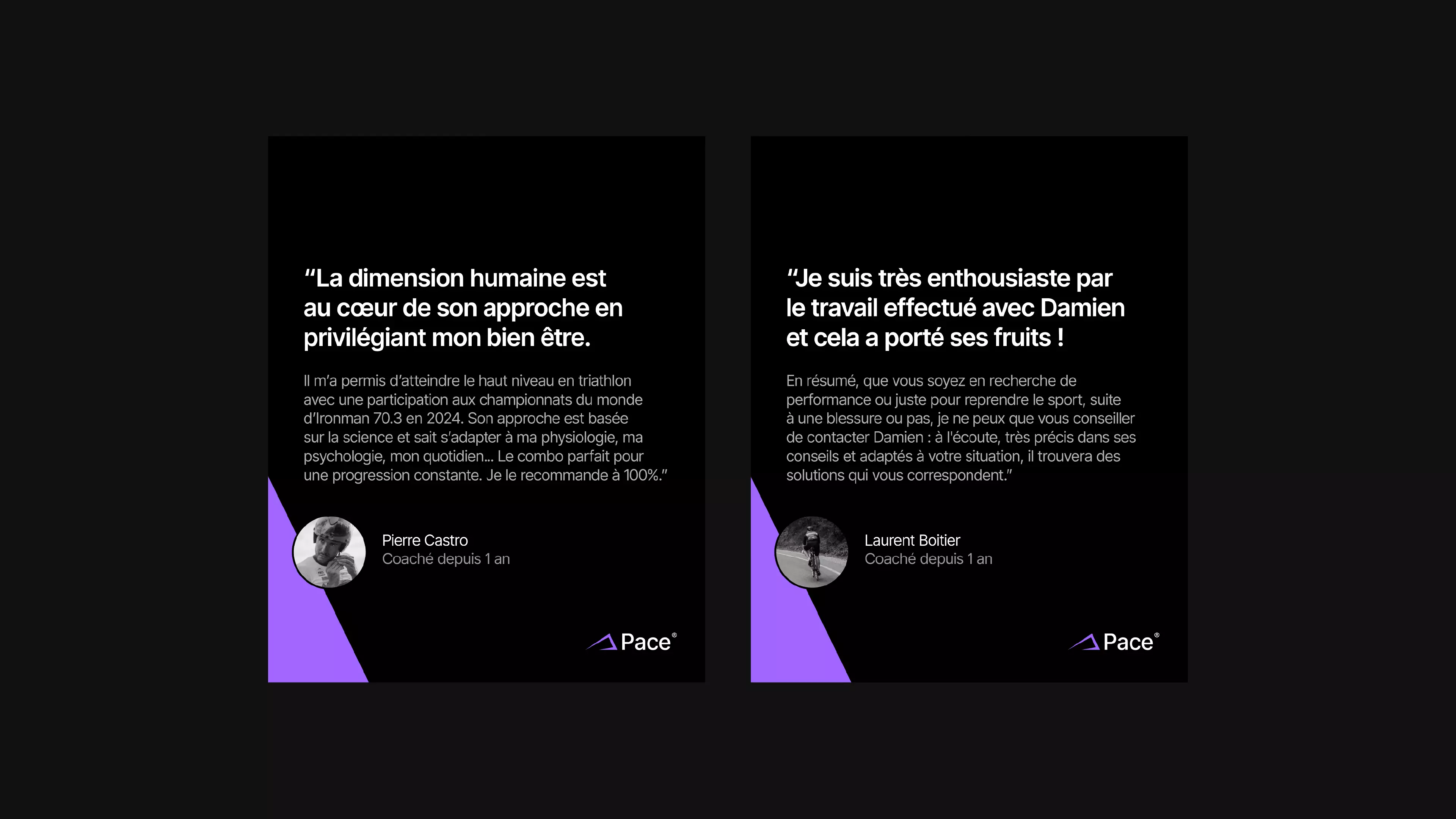
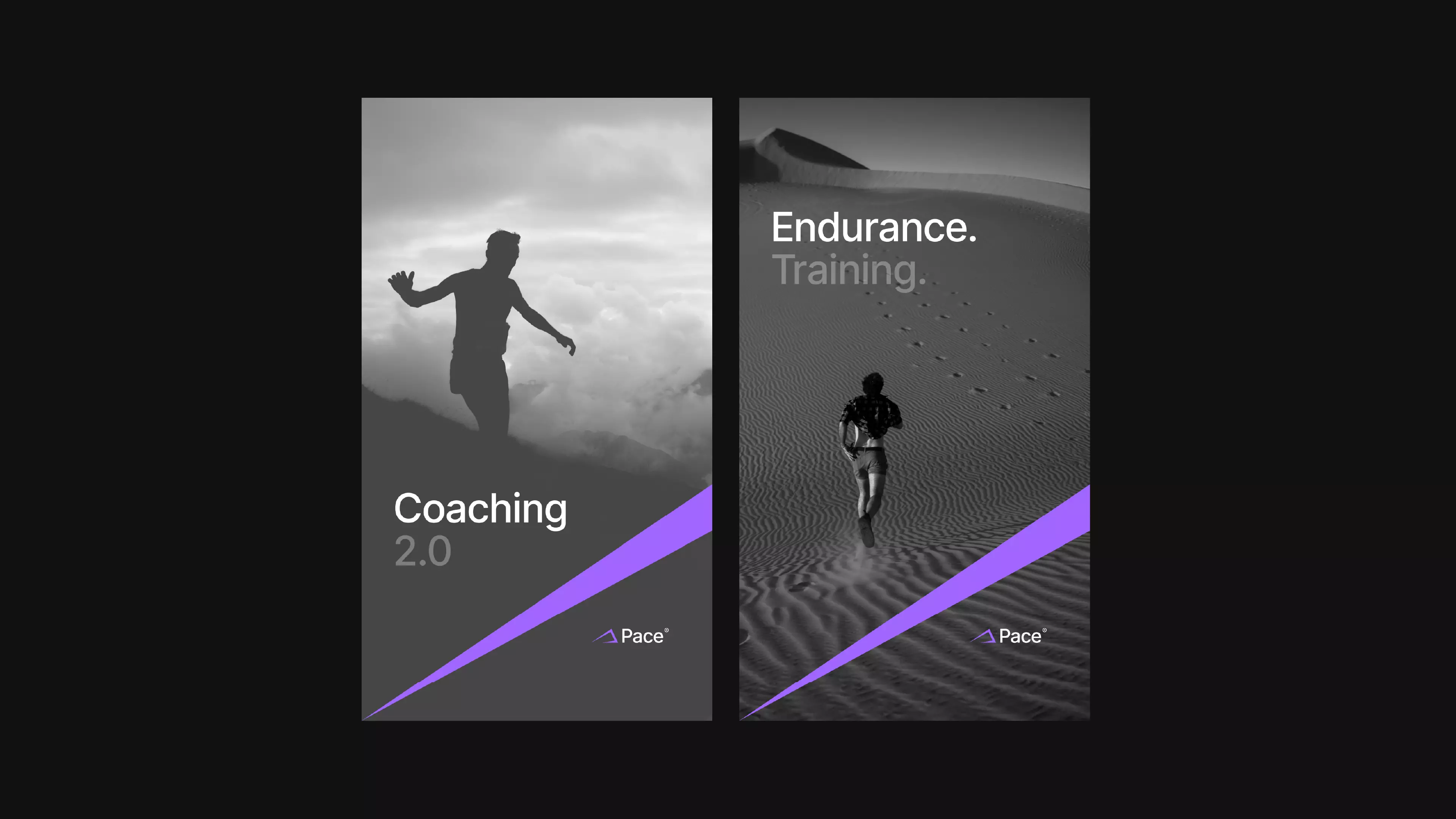
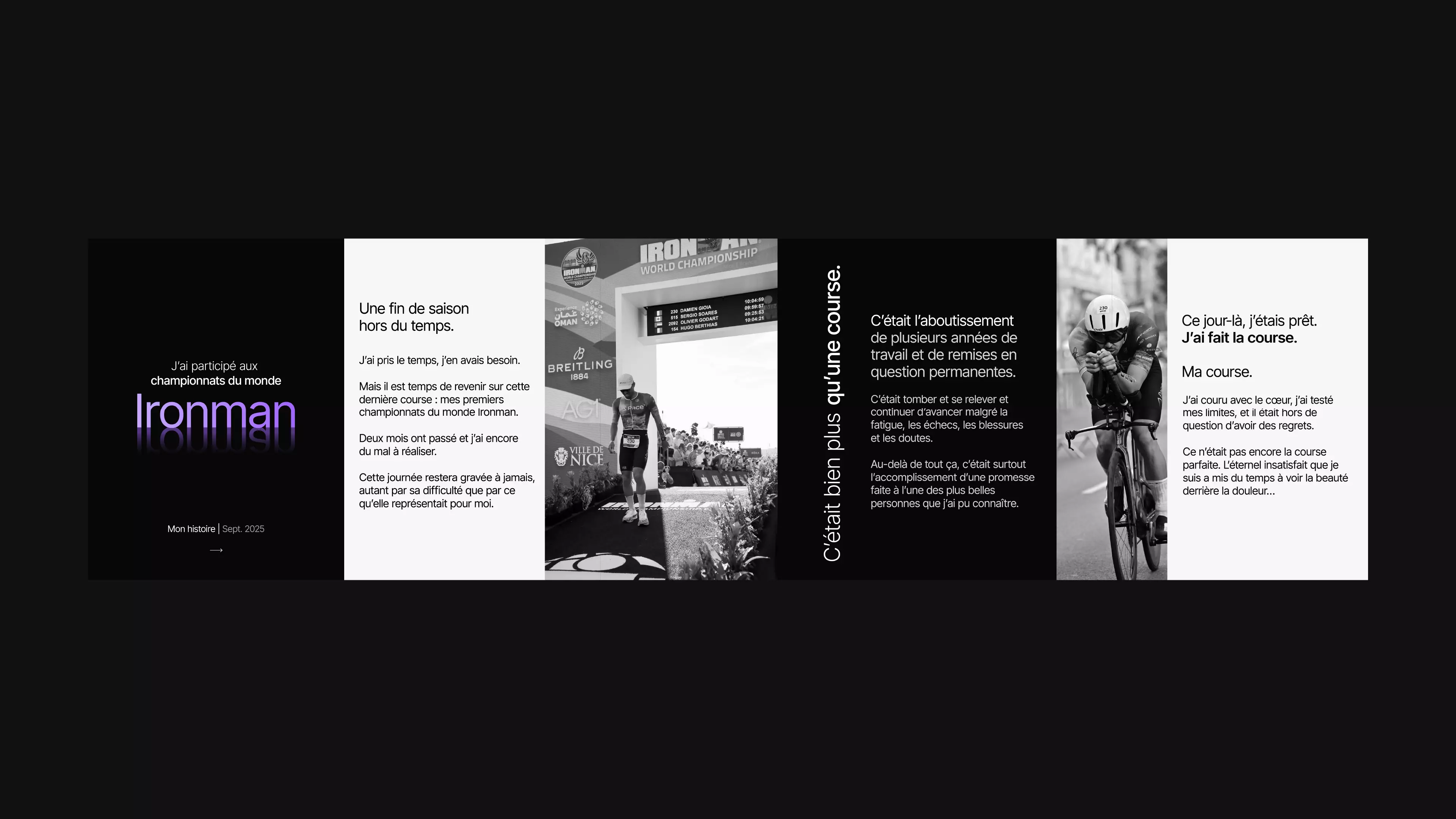
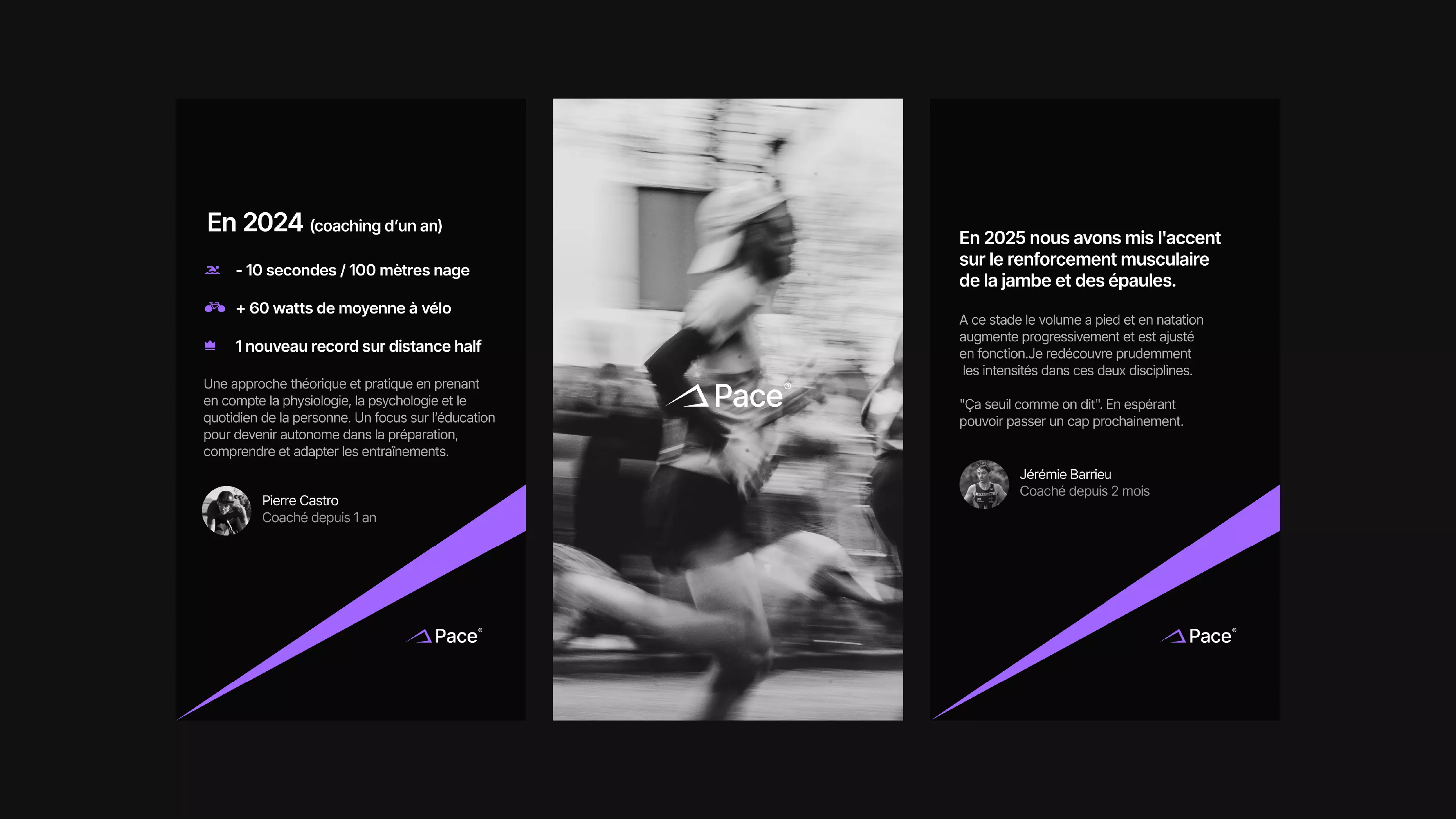
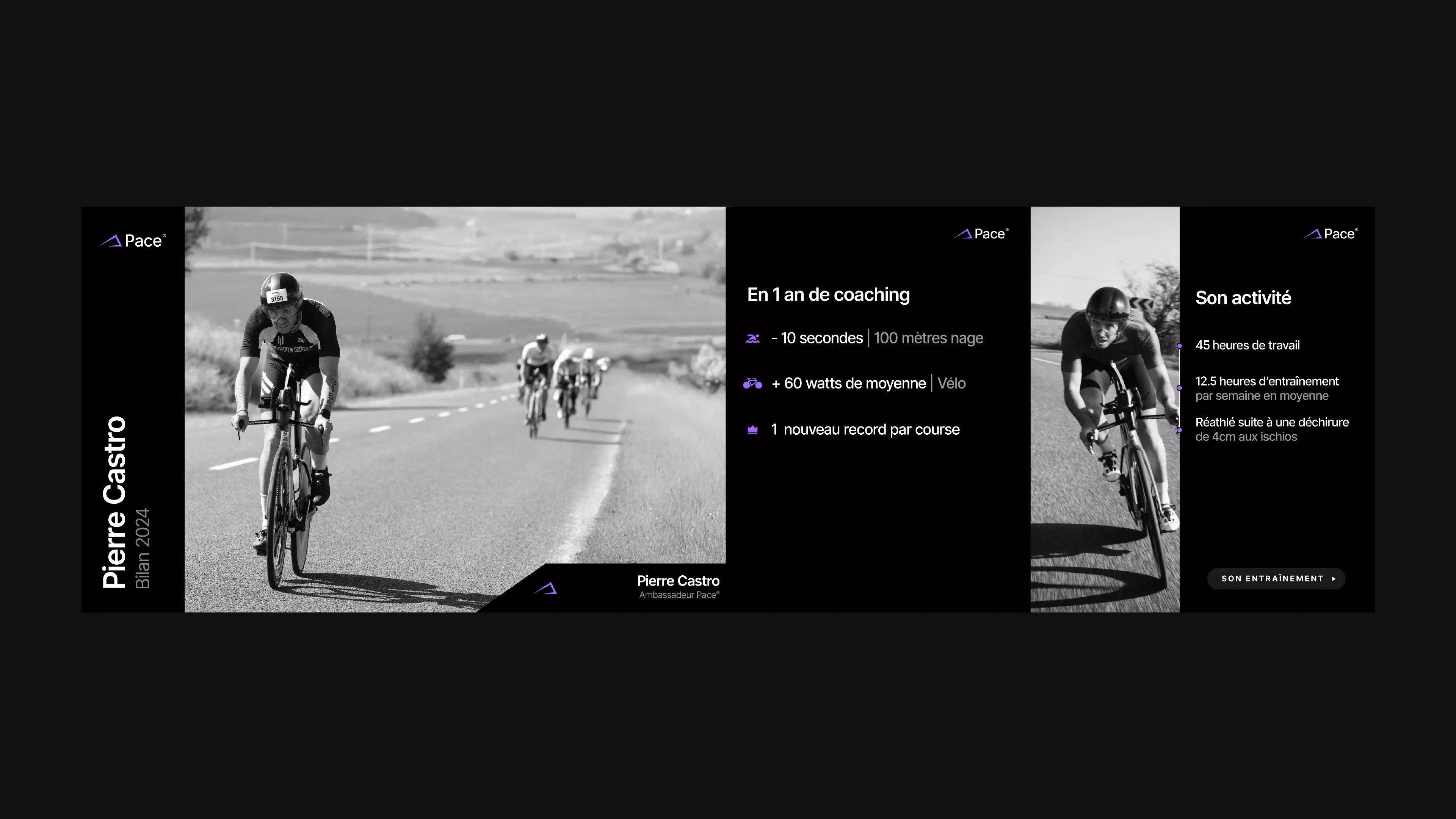
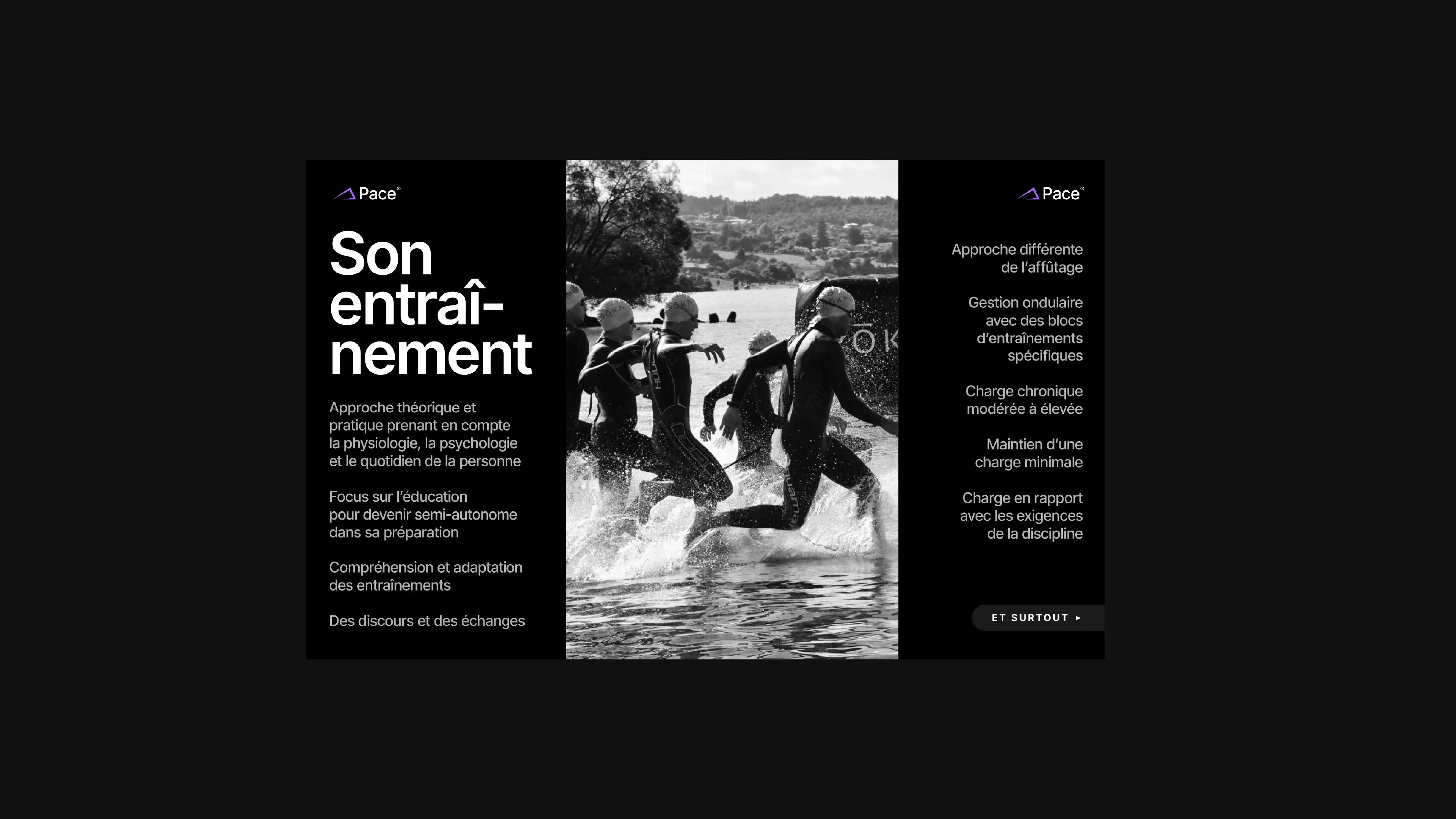
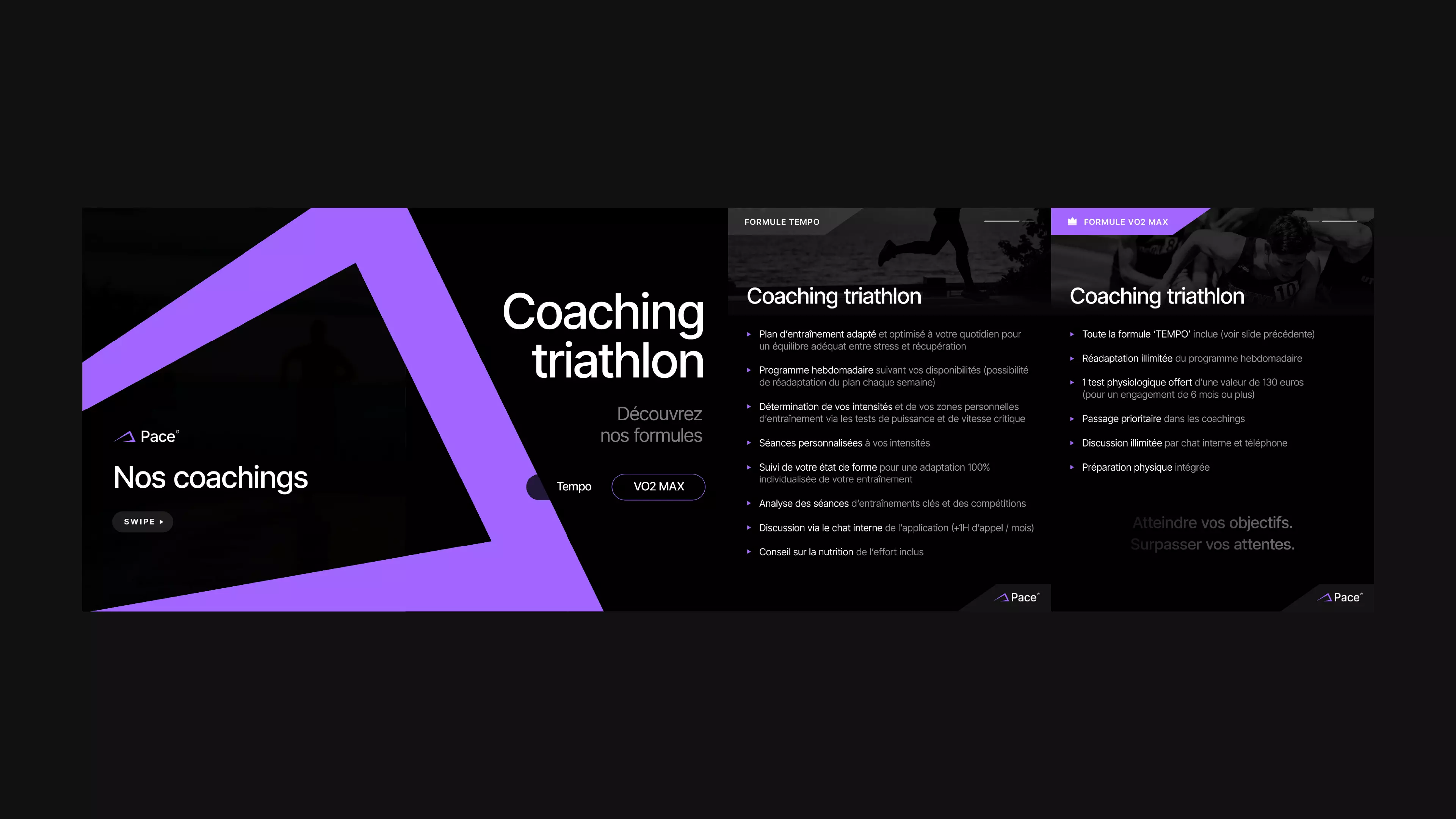
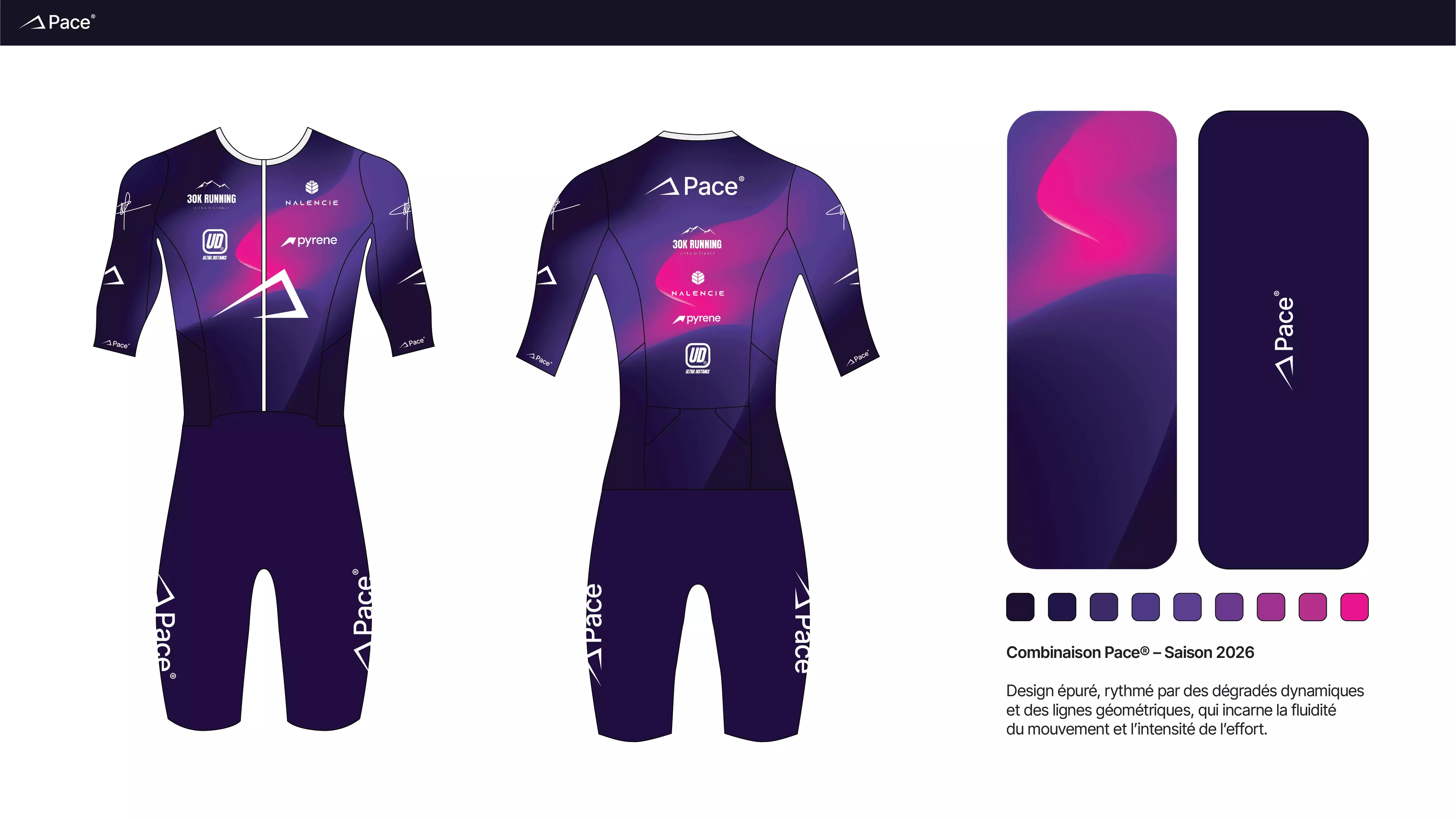
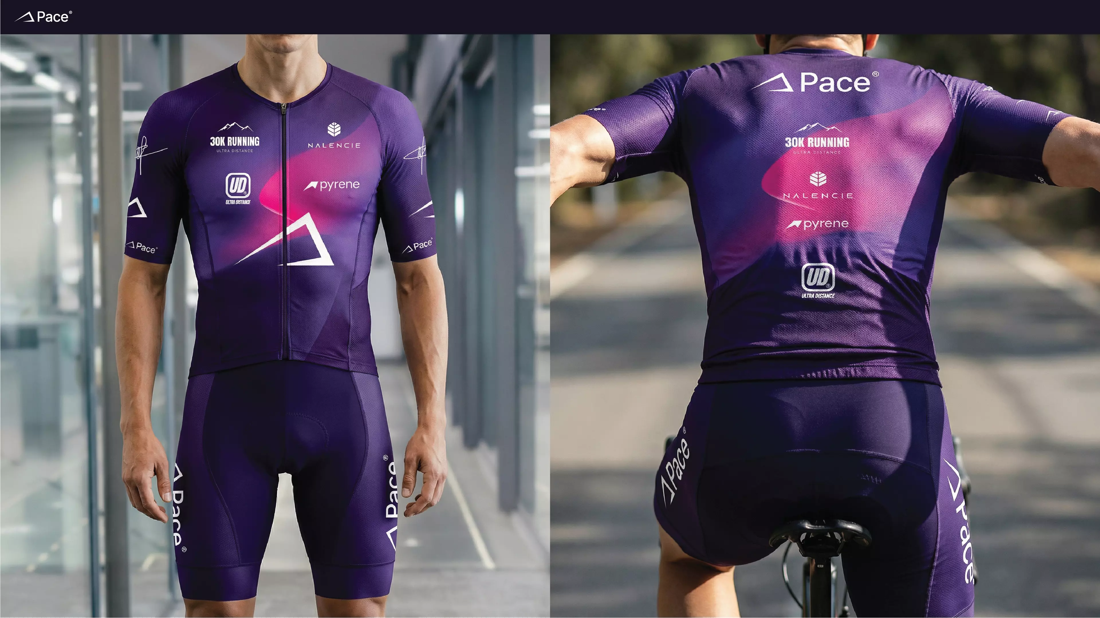
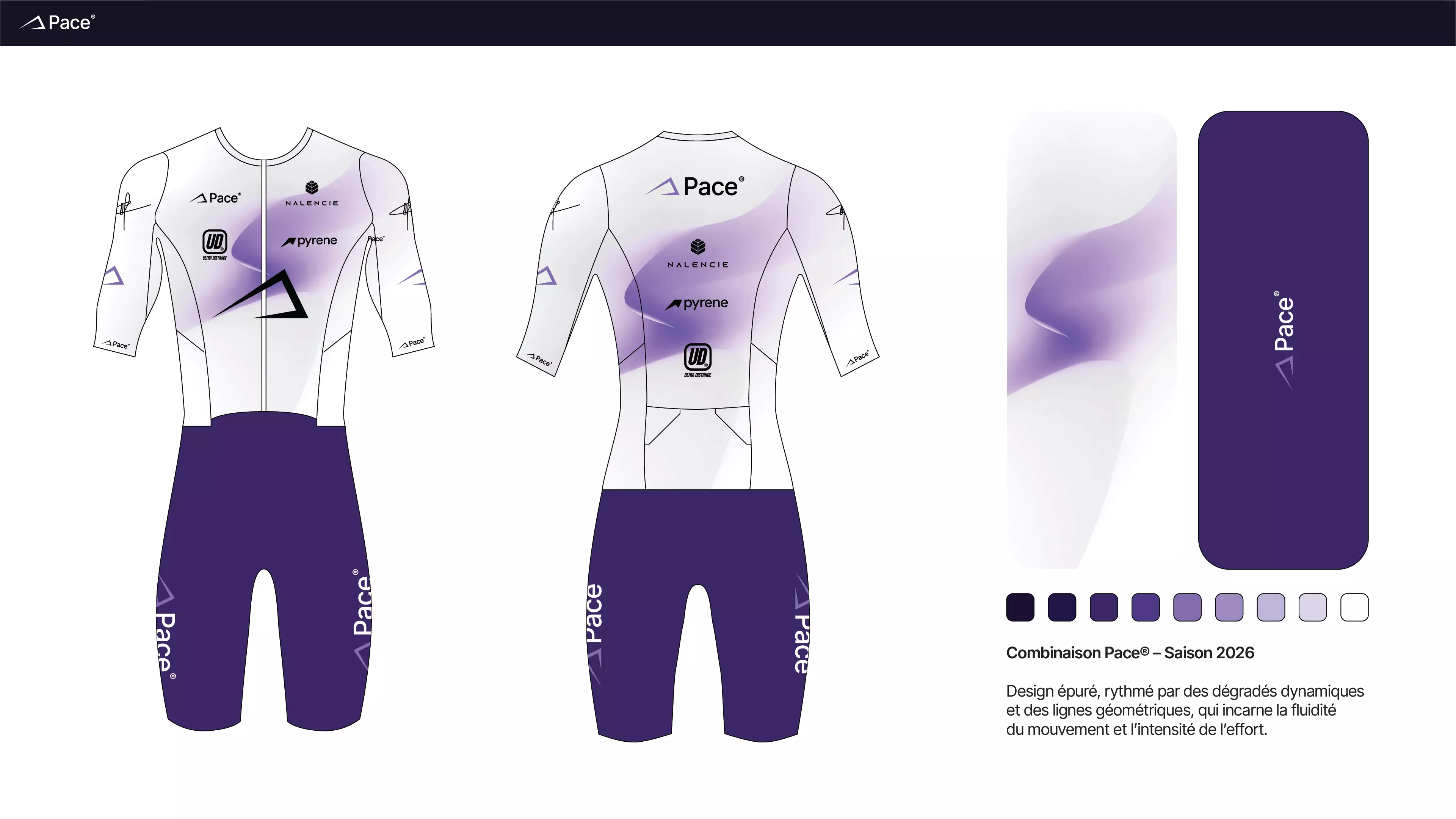
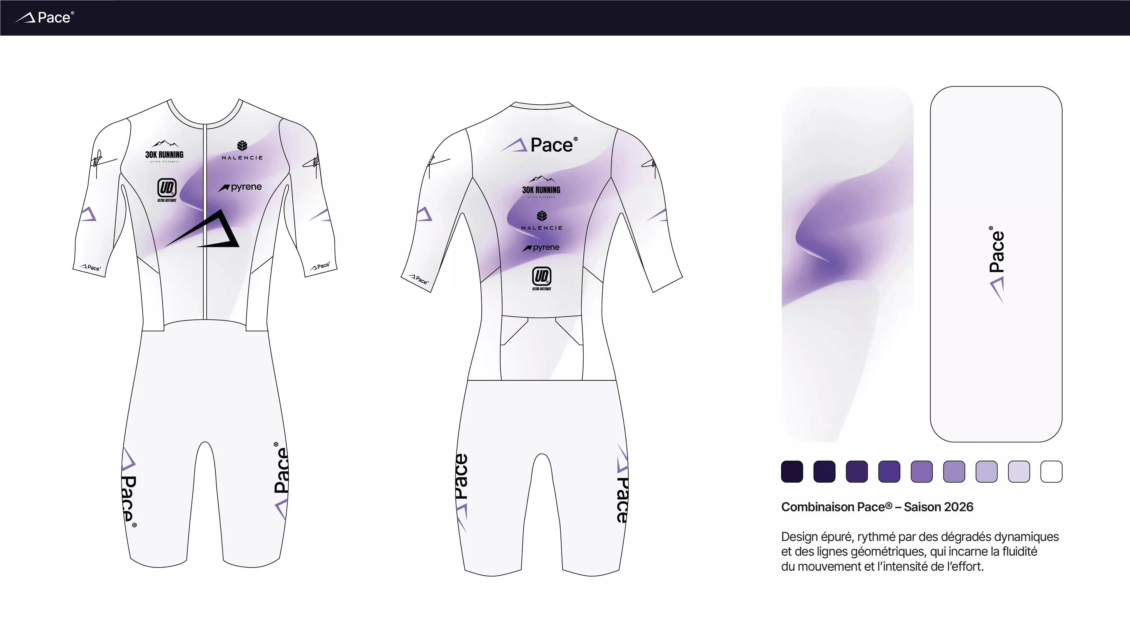
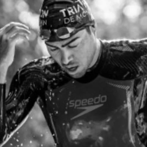
Damien is a triathlon coach based in Toulouse who works with endurance athletes across running, cycling and swimming. His approach blends data-driven programming with real human connection. Athletes come to him for structure, accountability and the confidence that makes the difference on race day, but also throughout the year during every training session.

02

Challenge

A coaching service with no visual identity

Damien had the athletes and the methodology, but the brand didn't match the quality of the coaching. No logo, no visual system, no website that could convert visitors into clients. In a market where every triathlon coach and fitness professional has an Instagram page, Pace needed to look and feel like the premium service it actually is.

03

Scope

Brand system + digital presence + apparel

Brand strategy and positioning, icon and logo design, complete visual identity system, colour palette and typography, art direction for content, social media templates, website design and development on Framer, triathlon kit and apparel design, and ongoing creative partnership.

04

Approach

Performance translated into visual language

Every decision started from the same principle: the brand should feel like the coaching. Rigorous but human. Demanding but welcoming. We immersed ourselves in Damien's world — his athletes, his methodology, his race calendar — and translated what we observed into a visual language that could stand on its own.

[01 — coaching brand strategy]

A coach who deserved a brand as serious as his coaching.

Damien came to us through the endurance community — the same world that connected us with Pyrene® and Ultra Bike France®. He'd been coaching triathletes in Toulouse for years, building his reputation through athlete results, not marketing. The kind of coach people recommend to each other at the start line.

Pace® already existed as a name and a following. But the identity had been built early on, in a rush, and the business had since outgrown it. This was a rebranding. The coaching was excellent — the brand just needed to catch up to match the founder's vision.

Pace® — triathlon coaching brand identity system overview

[02 — sports coaching icon design]

The art direction started with a simple question: what does endurance actually look like? Not the glossy, sponsor-covered version. The daily reality. Early mornings at the pool, solo rides before dawn, interval sessions in the rain. That raw, unglamorous texture became the visual foundation — honest images of what it means to train seriously, not stock photography of finish lines.

An icon for a coaching brand has to work everywhere — on a jersey, on a watch face, as a social media avatar at 40 pixels. But before solving for size, we had to solve for meaning. What does Pace® stand for when you strip away the words?

1. Performance — The triangular form carries the DNA of triathlon: three disciplines, three edges, one shape. Swimming, cycling, running, held together.

2. Progression — The upward and rightward orientation signals the feeling of building week after week. Not a static badge, but a direction.

3. Clarity — Clean geometry, no ornament. The same focus Damien brings to his coaching: keep what matters, let go of the rest.

Pace® icon design — triangular triathlon symbol, movement and progression

[03 — logo construction & grid system]

The proportional system is derived from the icon's height (x), which defines every spacing and letter-spacing value in the logo. This modular grid ensures geometric consistency across all touchpoints. The logo needs to hold at every size, whether it's embroidered on a coaching jersey or sitting at 16 pixels in a browser tab.

The typographic choice was just as deliberate. Inter Tight — a neo-grotesque typeface, modern and geometric — carries the brand's voice across every touchpoint. Its condensed proportions feel dense and athletic without being aggressive. Clean letterforms that read perfectly on screens, from a desktop dashboard to a training plan on a phone. A typeface that belongs in the sports world without borrowing from it.

Pace® logo construction — proportional grid and measurement system

[04 — sports brand art direction]

The colour palette sets the tone: deep black (#111111) as the base — the quiet hours, the focus, the early starts. An energetic purple as the counterpoint — the race-day intensity, the moment you decide to push. That tension between calm and effort runs through every visual asset.

The typographic system extends beyond the logo. Headings use Inter Tight at heavier weights for impact; body text drops to lighter weights for readability in long-form coaching content. When an athlete opens a programme PDF or checks their weekly plan on the site, the hierarchy guides their eye before they consciously read a word.

Pace® art direction — colour palette, visual language and brand identity system

[05 — coaching website on Framer]

Built on Framer, the Pace® site was designed around two questions: what does an athlete need to know, and what do we want them to do next? The answer shaped every UX decision.

Strict grids, clear typographic hierarchy, restrained interactions. The homepage explains the philosophy. The programmes show the method. The booking flow removes friction. From the first scroll to the final click, the site follows the logic of a good training plan: each step leads naturally to the next, with one constant goal — getting the athlete to book a free call.

[website & digital]

01 / 06
Pace® website — homepage and hero section
Pace® website — coaching offer and conversion flow
Pace® website — coaching programme detail page
Pace® website — typography and grid system
Pace® website — athlete profile and booking
Pace® website — mobile responsive design

Looking to brand your coaching business?

Start a project

[06 — social media branding]

Training recaps, race previews, tips for athletes preparing their first half-Ironman. Before the rebrand, every post was a blank page. No templates, no visual consistency, no system. Now there's a framework he can use.

The content system is built around three pillars. Inspiration — race-day visuals, athlete stories, finish-line moments. The emotional fuel that reminds followers why they train. Information — training tips, technique breakdowns, recovery protocols. Content that proves there's depth behind the brand. Marketing — coaching offers, programme launches, booking prompts.

The templates are flexible enough to cover all three while maintaining visual consistency. That's the goal: create repetition to build recognition as a brand.

[social media branding]

12
Pace® social media — brand identity post
Pace® social media — coaching content
Pace® social media — athlete spotlight
Pace® social media — performance visual
Pace® social media — training programme post
Pace® social media — endurance content
Pace® social media — triathlon coaching visual
Pace® social media — brand system application
Pace® social media — race day content
Pace® social media — nutrition and recovery
Pace® social media — coaching offer promotion
Pace® social media — community and inspiration

Three disciplines.

One identity.

We build timeless brands in a matter of weeks.

Start a project

The brand also lives on fabric. The triathlon kits and training apparel were designed to carry the identity in motion — on a bike at 40km/h, in a peloton, crossing a finish line. Sublimation printing imposes its own constraints: colours shift, fine details bleed, contrast drops in direct sunlight. Every graphic element was tested for legibility at speed and at distance. The result is apparel that athletes are proud to wear, not because it's loud, but because it looks like it belongs to something they trust.

[sports apparel]

01 / 06
Pace® triathlon kit — cycling jersey front
Pace® triathlon kit — cycling jersey back
Pace® triathlon kit — tri suit design
Pace® triathlon kit — running singlet
Pace® triathlon kit — apparel detail and branding
Pace® triathlon kit — full collection overview

[conclusion]

Pace® went from a name athletes already trusted to a brand that earns that trust visually, before the first conversation. The website works. The social media has a system. The identity holds across a screen, a jersey, and an Instagram grid. It's not flashy work — it's the kind that quietly closes the gap between what a business is and what it looks like. The same approach behind a nutrition brand in the Pyrenees or an ultra-cycling event that needed a fresh start.

Pace® — triathlon coaching brand identity hero visual
Pace® — logo and visual language application
Pace® — colour system and art direction detail
Pace® — digital product and web design screen
Pace® — brand system application, athlete touchpoint
Pace® — final brand visual, performance identity system

[what the founder says]

Damien G.

Damien G.

Founder - Pace®

"Working with Richard was one of the best decisions I made for my business. From our very first conversations, he picked up on my vision and the direction I wanted to take, and translated it with real precision. The rebranding and the overall creative universe he built gave us a strong, consistent, and lasting identity. He threw himself into the project like it was his own, with a level of commitment you rarely come across."

[more branding projects]

(06)

Start your sports coaching branding project — Free consultation

Tell me about it — I'll get back to you within 24 hours with a free intro call proposal.

By submitting this form, you consent to your data being used to respond to your message.

Not ready yet?

Browse more projects ↑