Two days ago, Spotify replaced its iconic flat green circle with a textured, light-catching disco ball. Within hours, design Twitter split in half. One camp called it "horrific" and demanded an immediate reversal. The other camp called it the most interesting move Spotify has made in a decade. Both sides are missing the bigger story.
The bigger story is that flat design just got a date stamped on its coffin. May 13, 2026.
This is not a one-off anniversary stunt, even if Spotify is framing it that way (the disco ball is rolling out for the streaming giant's 20th birthday and is, for now, presented as a temporary celebratory mark). Look at what has actually happened in the past seven days. Spotify went textural on May 13. HYBE, the Korean entertainment giant behind BTS, dropped a new corporate identity the same day, leaning into dimension, depth, and an explicit "immersive journey" promise. Marathon Sports, the 51-year-old New England running retailer, unveiled a new logo on May 7 built around "motion and defining moments of running," not the geometric perfection that defined sports branding for the last decade. Three brand launches in seven days. Three rejections of the flat, sans-serif, mathematically pure language that has dominated identity work since 2013. That is a pattern, not a coincidence.
Why did Spotify turn into a disco ball?
The official answer is that Spotify is celebrating 20 years and wanted something playful for the moment. The real answer is more interesting.
Spotify's flat green icon was perfect, and that was the problem. Perfect in the way every app icon has been perfect since iOS 7 wiped skeuomorphism off the home screen in 2013. Perfect like every fintech logo. Perfect like every SaaS wordmark. Perfect like the 40 brand identities I scrolled through last week, all of which looked like they came from the same prompt.
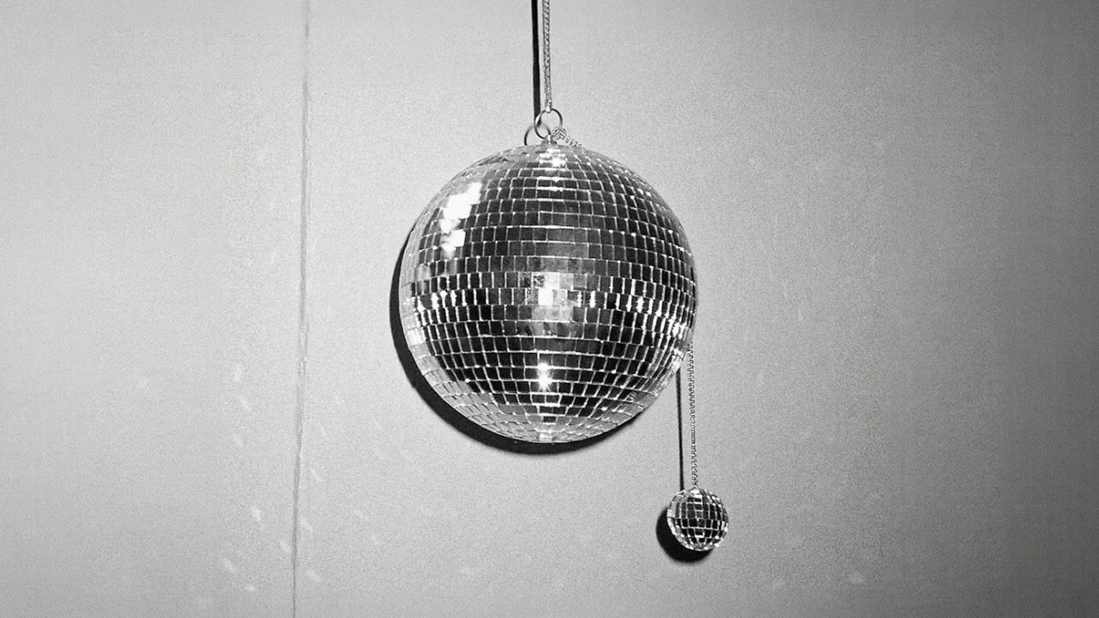
When perfection is the default, perfection stops meaning anything. So Spotify did the only thing left to do at 20. It added friction, weight, and visible craft. The new icon has gradients, highlights, a mirrored surface, real depth. Spotify design leader Lauren Weeber framed the move as the brand becoming "an expression of the zeitgeist" at cultural moments. Translated: the brand is supposed to feel different now, because the world feels different now.
The three soundwave lines that have defined Spotify since 2006 are still there, embedded inside the disco ball. That detail matters. Spotify did not redraw its identity. It re-textured it. The strategic move is preserving the equity while changing the surface treatment, and it tells you exactly where the industry is heading.
The flat design era is officially over
Flat design was a reaction to the late-2000s explosion of skeuomorphism, when iOS 6 had bookshelves that looked like real wood and a Notes app that looked like a yellow legal pad. By 2013, that aesthetic felt cluttered and dated, and Apple wiped it off the slate. The whole industry followed within eighteen months. Every fintech, every airline, every streaming service flattened, sans-serif'd, and pixel-perfected itself into a single visual language.
Twelve years later, that language has eaten itself. When Spotify, Pinterest, Airbnb, and a hundred SaaS tools all use the same Inter-style sans-serif on a near-white background with a single geometric icon, the visual differentiation collapses. You are not picking a brand. You are picking from a menu of indistinguishable polish.
Designers have been calling this out for a year. Searches for hand-drawn, textured, and imperfect design elements have jumped sharply year over year according to the Canva 2026 Design Trends Report and Adobe's Creative Trends data. We covered that counter-current in our piece on why imperfection is winning in 2026. What is new this week is that the texture instinct has crossed over from craft brands and indie studios into the biggest digital platforms on earth. When Spotify, with hundreds of millions of users, declares that the icon needs depth, the conversation is no longer about taste. It is about the next ten years of digital brand design.
What does texture actually signal in 2026?
Texture is the new proof of effort.
For the last decade, polish was scarce. It took a skilled designer with the right software and the right judgment to make something flat, clean, and balanced. That scarcity gave polish meaning. A clean Helvetica wordmark on a white background signaled "we hired professionals."
In 2026, polish is free. Midjourney, Canva, Figma's AI features, Claude Design, and a dozen consumer tools will give anyone a flat, balanced, professional-looking identity in twelve seconds. The signal has flipped. When anyone can make something polished, polish stops being a signal at all.
What cannot be faked yet, at least not cheaply, is the impression of physical craft. A gradient that looks hand-blended. A texture that suggests material. A surface that catches light the way a real object does. The new Spotify icon is not just a disco ball. It is a brand saying "we still invested human hours into this." That investment is the signal valued by audiences who have spent the last two years drowning in AI-flat content.
This is the same logic driving the broader return to physical anchors in design, which we explored in our analysis of Amazonia and Macallan's place-anchored identities. The texture move and the place move come from the same anxiety. Brands that look like everything else look like nothing.
What can we learn from Marathon Sports and HYBE this week?
Three brand launches in seven days, three different industries, three different scales. The pattern only becomes visible when you put them side by side.
Marathon Sports, on May 7, replaced a fifty-year-old wordmark with a bold new icon "drawn from the motion and defining moments of running." Their team kept the heritage logo alive for retro merchandise, which is the smart play. You do not erase five decades of brand recognition. You frame it as legacy. The new mark is rounded, weighted, and explicitly tactile, in contrast to the geometric sans-serif athletic wordmarks that dominated the category from Nike's 1990s cleanup onward.
HYBE, on May 13, launched a corporate identity built around the mission "DISCOVER A NEW UNIVERSE, UNLOCK AN IMMERSIVE JOURNEY." That line is doing real work. HYBE is no longer trying to be a Korean record label. It is positioning as a global immersive experience company, which is why the new identity leans into depth, dimension, and a more expressive type system instead of the cool corporate minimalism most music labels still favor.
And Spotify, on May 13, made the most public move of the three with the most divisive icon refresh of the year. Same week, same instinct: more dimension, more visible texture, more emotional surface area.
The takeaway for any founder watching this. The bar for visual differentiation just moved. A flat geometric mark on a white background no longer reads as "modern" in 2026. It reads as "default." That is a problem if you are paying for a brand identity.
Is skeuomorphism really back, or just dressed up?
Here is the counter-argument, and it is a serious one.
The Spotify icon is not actually skeuomorphic in the iOS 6 sense. It is not pretending to be a real disco ball you could pick up. It is a stylized, simplified reference to texture and depth, built with gradients and shadows but without the hyper-realistic detail of late-2000s app icons. Designers are calling this "neo-skeuomorphism" or "modern skeuomorphism," and the distinction matters. Apple's iOS 26 update did exactly the same thing earlier this year. It brought back depth and tactility without bringing back the cluttered photorealism of 2010.
So the honest read is that the industry is not returning to skeuomorphism. It is moving past flat into a third state. Textural, dimensional, but still simplified. Call it post-flat. The question for any brand owner is whether to follow.
The risk is that "post-flat" becomes the next homogeneous trend. We have seen this cycle before. In 2014, every startup adopted flat design because Apple did. In 2017, every brand added a gradient because Spotify did. In 2019, every fintech turned to neo-mint and Inter sans-serif because Stripe and Linear did. By the end of 2026, every imperfect, hand-drawn, slightly wonky logo is going to look exactly as same-y as the flat ones did, because the underlying behavior of copying the cool kids has not changed. Imperfection-as-strategy has a shelf life.
The brands that will win this transition are not the ones racing to add texture. They are the ones asking why texture matters for their specific story, and resisting the temptation to chase the look without the meaning. Spotify can do a disco ball because Spotify is about music and culture and parties. A B2B compliance tool doing the same move would just look confused.
What founders should take from this
If you are about to commission a new brand identity in 2026, three practical takeaways from this week.
First, ask your studio how the brand will look in motion, not just in static. The Spotify icon works because it suggests movement and light. A logo that only lives as a static PNG is going to feel outdated by the time it ships. Motion is the new minimum, and most studios are still treating it as an afterthought.
Second, ask where the texture, dimension, or material reference comes from. If the answer is "we thought it would look cool," that is a fashion choice and it will date fast. If the answer ties to your product, your category, or your founding story, that is a strategic choice that can hold for a decade.
Third, resist the urge to chase the disco-ball move for your own brand just because Spotify did one. Most brands do not need a viral redesign. They need an identity that tells a true story consistently across every touchpoint. That work does not trend on Twitter, but it is the work that compounds. If you want to see how we approach that with founder-led brands, our services page walks through the process and the projects we have built show what it looks like in practice.
The flat design era is over. The textural era will be over too, eventually. What matters is whether your brand stands for something specific enough that you do not have to keep chasing the next surface treatment. That has always been the real question. This week just made it impossible to ignore.
Sources
- Creative Bloq: Spotify's new logo is already getting torn to shreds (May 14, 2026)
- SSBCrack News: Spotify Faces Mixed Reactions Over New Disco Ball Icon for 20th Anniversary (May 14, 2026)
- Rolling Out: Why Spotify's new logo is already being reversed (May 15, 2026)
- Outdoor Sports Wire: Marathon Sports Unveils New Brand Identity as It Enters 51st Year (May 7, 2026)
- Bandwagon: HYBE unveils new mission, vision and brand identity for its next era (May 13, 2026)