I spent last week watching two brands unveil identities that could not be generated by any prompt. Amazonia, the new destination brand for the nine-state Brazilian Legal Amazon, carved its wordmark from the actual curves of the Amazon River basin using satellite coordinates. On April 17, The Macallan debuted a redesigned bottle in Lagos whose silhouette traces the sweeping roofline of the distillery itself, drawn by David Carson. Neither brand asked for "premium organic luxury minimalism." Both started with a real place and let geography draw the logo.
This is the move I find most interesting about April 2026. When any challenger brand can now generate a visual identity in twelve seconds, the studios doing the best work are walking in the opposite direction. They are not fighting AI with better prompts. They are fighting it with coordinates, rooflines, Victorian stencils, and river bends. Design is returning to the ground.
Three things lined up this month to make the pattern obvious. Amazonia went public with FutureBrand São Paulo's work at scale. David Carson unveiled his Macallan redesign in Nigeria on April 17, the brand's first major packaging shift in more than a decade. And on April 14, Creative Boom published its April 2026 type roundup, a list dominated by foundries going back into archives: Matthew Carter rebuilding a Dwiggins Scotch Roman, Kyiv Type Foundry recovering lettering from the city's Metro stations, Midwest Type pulling from Victorian stencils on rural Ohio machinery. Three very different releases. One underlying reflex: anchor the work in a real place, a real object, or a real archive.
What does place-based design actually look like in 2026?
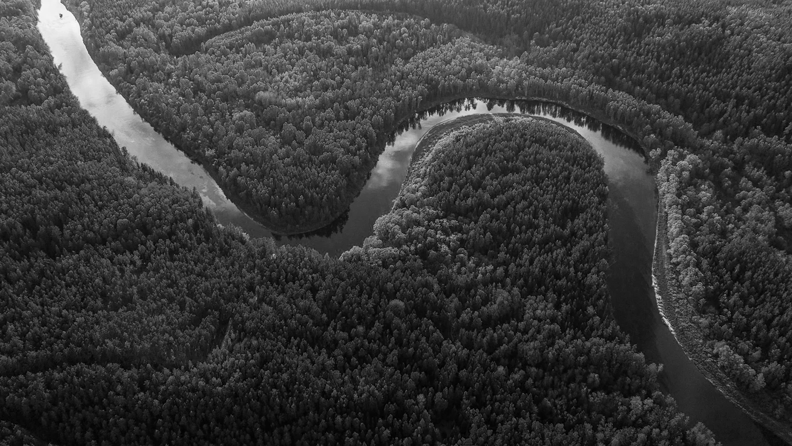
It looks like Amazonia's wordmark. FutureBrand São Paulo's team did not draw the letterforms. They found them. Using real satellite coordinates of the Amazon River and its tributaries (roughly 25,000 kilometres of navigable waterways), they traced the water itself to construct an alphabet. Each letter in "AMAZONIA" corresponds to an actual bend of the basin. The result is a brand identity that could not exist for any other place on Earth. The logo is the territory. The territory is the logo.
When nine states (Acre, Amazonas, Amapá, Maranhão, Mato Grosso, Pará, Rondônia, Roraima, Tocantins) needed one shared visual platform without losing their regional character, geography became the unifier. FutureBrand built a living system with rotating palettes and motifs drawn from local artists in each state: illustrators Cristo, Winy Tapajós, Malu Menezes, Beatriz Belo, photographers Ori Junior and Bob Menezes. The typography foundation lets the brand shift visual register (biodiversity in one context, tourism promotion in another, sustainable commerce in a third) without ever losing its core. That is the 2026 definition of a brand system: not a static logo, but a set of rules that lets a place speak its own language across radically different applications. We wrote more on that systemic shift in our piece on why static logos are dead in 2026.
The Macallan turned its own roof into a bottle
On April 17, 2026, The Macallan officially launched its redesigned Double Cask and Sherry Oak collections through a Timeless Collection unveiling in Lagos. Creative direction: David Carson. The brief: the brand's first full packaging refresh in more than a decade. Carson's solution starts where the whisky is actually made. The new bottle silhouette traces the sweeping roof of The Macallan Distillery in Speyside, a building already famous inside architecture circles. Carson kept the triangular shoulder label, Macallan's long-standing visual anchor, and reframed it as a nod to the Sherry Triangle in Spain where the oak casks originate. Two places. One bottle.
The interesting move is how the redesign handles authenticity in 2026. The packaging is fully recyclable, with foiling and plastic removed. The glass is lighter. Rear labels now carry cask-type symbols to explain American versus European oak, and each bottle embeds anti-counterfeit tech with a QR code for traceability. So the redesign simultaneously anchors the brand in two real, ancient places (a Speyside distillery, a Spanish wine region) and plugs into modern digital verification. It is heritage and traceability in the same object. Very few prompts would land you there. You get there by visiting the place.
Why is place beating prompt in the AI era?
Because AI-generated identity has a semiotic problem. When anyone can generate a "warm minimalist coffee brand" in one prompt, every warm minimalist coffee brand starts looking like the reference set the model was trained on. The polish stops signalling investment. We covered this dynamic in our article on why imperfect design became the defining trend of 2026, and place-based design is the same counter-current seen from a different angle. If imperfection says "a human touched this," place says "this brand could only exist here."
The economic logic matches. A prompt-generated identity costs thirty minutes of GPU time. Amazonia's alphabet required satellite cartography, collaboration with artists across nine Brazilian states, coordination with the Brazilian tourism board Embratur and with RAI, and custom type drawing. The Macallan redesign required David Carson on a plane to Speyside. Neither project is efficient. That is the point. The cost of making the identity is legible in the final object. In an attention economy flooded with generic AI aesthetics, the thing a brand can still buy that competitors cannot replicate is a process rooted in a specific place. The effort is the moat.
There is a cultural reading too. Both of these brands operate in categories where authenticity is the entire pitch. A destination brand selling a rainforest that can only exist in Brazil. A single-malt whisky matured in a specific valley. Using satellite river data or a distillery roof is not a stylistic flourish. It is the product's story made visible in the identity. The design only works because the brand could not make it work somewhere else.
Type is going back to craft for the same reason
If you only looked at logo redesigns, you might think place-based design was a quirk of April. Then read Creative Boom's April 2026 type roundup, published April 14. MCKL dropped Atlantic (three widths, seven weights, plus italics). DynaComware released Reikintai. Cocijo released Draco. Kind Type Foundry released Missive Bead. Emtype released Eternia. None of these foundries are chasing AI aesthetics. The roundup's editorial thread is the opposite: a month dominated by craft revivals and historical sources. Matthew Carter returned to a Dwiggins Scotch Roman. Richard Lipton drew from Dwiggins's hand-lettered book designs. Kyiv Type Foundry recovered lettering from the city's Metro station signage. Midwest Type pulled from Victorian stencils on rural Ohio farm machinery.
Read that list again. Not one of those typefaces could be prompted into existence. Each one starts from a physical artefact, a specific place, or a named archive. Type is doing exactly what Amazonia and Macallan are doing at the identity level. When the bar for generic polish drops to zero, the premium moves to work that is anchored somewhere. You can prompt a clean sans-serif. You cannot prompt the exact curve of a 1943 Ohio stencil without that stencil existing in the world first. The work carries the place with it.
The motif repeats across industry events. HD Expo, the hospitality design world's biggest annual gathering, unveiled its rebrand by forceMajeure earlier this month around the concept of "a portal into possibility," with an arch motif pulled from real architectural thresholds. On April 20, the University of Western States launched a new visual identity designed to anchor its 120-year integrated-health legacy in something physical and recognisable. Different sectors, same logic. Ground the identity in something that exists in the world, or lose the premium.
When does place-based design slide into gimmick?
Here is the counter-argument, and it is a real one. Place-based design has a shelf life. The moment a yogurt brand in Stockholm starts tracing a fjord to build its wordmark with no functional reason for doing so, the move stops being specific and becomes a template. This is the pattern with every aesthetic counter-trend. Jaguar's provocative rebrand was fresh in December 2025 and was already being imitated by late March. Imperfect typography went from subversive to genre in eighteen months. Place-based design will follow the same arc if every junior studio starts pitching "a logo drawn from a map" regardless of whether the client's story justifies it.
The test is whether the place actually belongs in the brand. Amazonia's wordmark works because the product is the basin. You cannot separate the logo from the territory because they are the same thing. Macallan works because the distillery roof is already a visited, named, photographed landmark for whisky lovers. When the brand-to-place fit is real, the identity gains weight. When it is not (a B2B SaaS tracing its founders' hometown into a wordmark for no functional reason), the move reads as costume. The rule for creative directors is simple. If the place can be swapped for another place without changing the story, the place does not belong in the logo.
There is a second risk. Place-based design is expensive to execute well. Satellite cartography, collaboration with nine regional teams, architectural research, archive licensing, custom type drawing: none of this is cheap. For most founder-led brands, a literal Amazonia approach is out of reach. The better reading of the trend for smaller clients is not "hire a cartographer." It is: find the specific, verifiable, place-anchored detail that only your brand can claim, and make it the spine of the identity. A coffee roaster working with a named single-origin farm has a specific place. A hotel sitting in one specific valley has a specific place. The brand move is to surface that specificity and design around it, rather than hide it under generic polish.
If you are briefing a creative director this week, stop asking for Dribbble references and start asking one question. Where does this brand physically live, and what would the identity look like if we treated that place as non-negotiable. The answer will feel constraining. That is the point. In an attention economy where generic polish is a commodity, constraint is how you get distinction. Amazonia gets it from a river. Macallan gets it from a roof. Your brand probably has a ground of its own you have not used yet.
For a look at how we approach this with early-stage clients, see our services page or explore the projects we have built for founder-led companies. The best identity work of April 2026 is not coming from better AI prompts. It is coming from designers willing to stand in a specific place and draw from there.
Sources
- Creative Review: The Brazilian Amazon gets historic new brand identity (April 2026)
- Famous Campaigns: Brazilian Amazon gets a brand identity built from its rivers (April 2026)
- The Punch Nigeria: The Macallan unveils whisky bottle redesign in Lagos (April 17, 2026)
- Creative Boom: The best new typefaces for April 2026 (April 14, 2026)
- The Architect's Newspaper: HD Expo unveils new brand identity ahead of 2026 event (April 2026)
- GlobeNewswire: University of Western States launches bold new visual identity (April 20, 2026)