On January 21, 2026, YouTube quietly rolled out the biggest visual refresh of its 20-year history. No press tour, no Super Bowl spot, no celebrity director hired to lend the brand a new identity. Just a coordinated update across YouTube TV, Shorts, Music, Premium and Kids, accompanied by a single short post on the Google Design library and a behind-the-scenes Sharp Type case study. For a platform watched by 2.7 billion humans every month, that restraint is itself the headline.
Most coverage focused on the surface: a new red, a new gradient, a "fresher" look. That misses the point. The 2026 refresh is one of the most disciplined system-design exercises a tech brand has shipped this decade, and the lessons it offers to founders building their first brand are arguably more valuable than the lessons it offers to other tech giants.
Why does a refresh after 20 years matter?
YouTube launched in April 2005. For 20 years, its visual identity had been refined incrementally: a logo tweak in 2017, a play button update, a darker UI here, a corner radius adjustment there. The result, by 2025, was a brand stretched across an ecosystem that no longer hung together. YouTube TV looked nothing like YouTube Music. Shorts borrowed visual cues from TikTok rather than from its own parent. Premium felt like a financial product. Kids was an island.
The 2026 refresh, documented by Marketing Dive on January 21, isn't a logo change. It's a re-architecture. The work was led by YouTube's in-house creative team, with Sharp Type developing the new display typeface and Gesture Systems building the illustration framework. That collaborative model, where the internal team owns the system and specialists handle the deepest craft layers, is the structural choice every founder should study before they hand a rebrand to "an agency".
The reason this refresh matters now, specifically, is that YouTube has stopped being a video site. According to Ad Age's January 21 coverage, YouTube reframed itself in the announcement as a "broad-based entertainment brand." That reframing is what a system rebuild has to express. You don't update a logo to communicate a strategic shift. You rebuild the toolkit.
Sharp Type and the typeface as foundation
The new YouTube Display typeface is the most important and least talked-about piece of the refresh. Sharp Type's published case study describes it as a "heavy lifting display typeface that builds on YouTube's brand equity," designed to extend the geometry of the YouTube logo into a full character set, and engineered to support nine global writing systems.
Nine scripts is not a vanity stat. It's the practical answer to a structural problem: when your top three markets are India, Brazil and Indonesia (and not the United States), Latin-only typography is a form of self-inflicted brand fragmentation. Local marketing teams have to substitute fonts, hierarchies break, headlines lose impact. The new YouTube Display ensures a Hindi headline carries the same visual weight as an English one. That's a system decision dressed up as a typography decision.
The geometry detail is also worth pausing on. Most platform rebrands commission a brand-new typeface that has nothing to do with the wordmark, and they end up with a logo and a font that share a colour palette and nothing else. By drawing the typeface from the logo's own curves, Sharp Type collapsed two design layers into one. The wordmark and the headline now feel like the same family because they are. The system is the deliverable, not the logo.
A logo is a moment. A type system is the rest of the brand. Most rebrands invest in the wrong layer.
What does "Camera Shake" actually signal?
The first motion identity in YouTube's history is built around behaviours like "Camera Shake": micro-tremors, focus pulls, the slight imperfection of handheld footage. ALM Corp's deep dive published in early 2026 describes the principle as "motion that reflects the rhythm of real content rather than imposing a manufactured smoothness."
This is the most strategically loaded decision in the entire refresh, and most coverage glossed over it. For two decades, every tech brand treated motion as a polish layer: easings borrowed from material design, perfectly straight transitions, a quiet visual obedience. YouTube just broke that consensus on purpose. The brand's motion language now intentionally feels like the content it hosts: handheld, alive, slightly imperfect. The platform stops pretending it's a piece of software and starts behaving like the medium.
This connects directly to the broader shift we documented in our piece on why imperfect design is the biggest trend of 2026. When perfect polish is free (generated, automated, frictionless), the absence of polish becomes the new signal of authenticity. YouTube isn't following that trend. They're institutionalising it at a scale no other brand can match.
The motion system also includes a concept the team calls "Alive": elements that subtly breathe, pulse or react to interaction in ways that suggest a living organism rather than a static interface. Combined with Camera Shake, the message is consistent. YouTube is not a tool. It is a place where creators live, and the brand should feel like that, not like the back-office software of a media company.
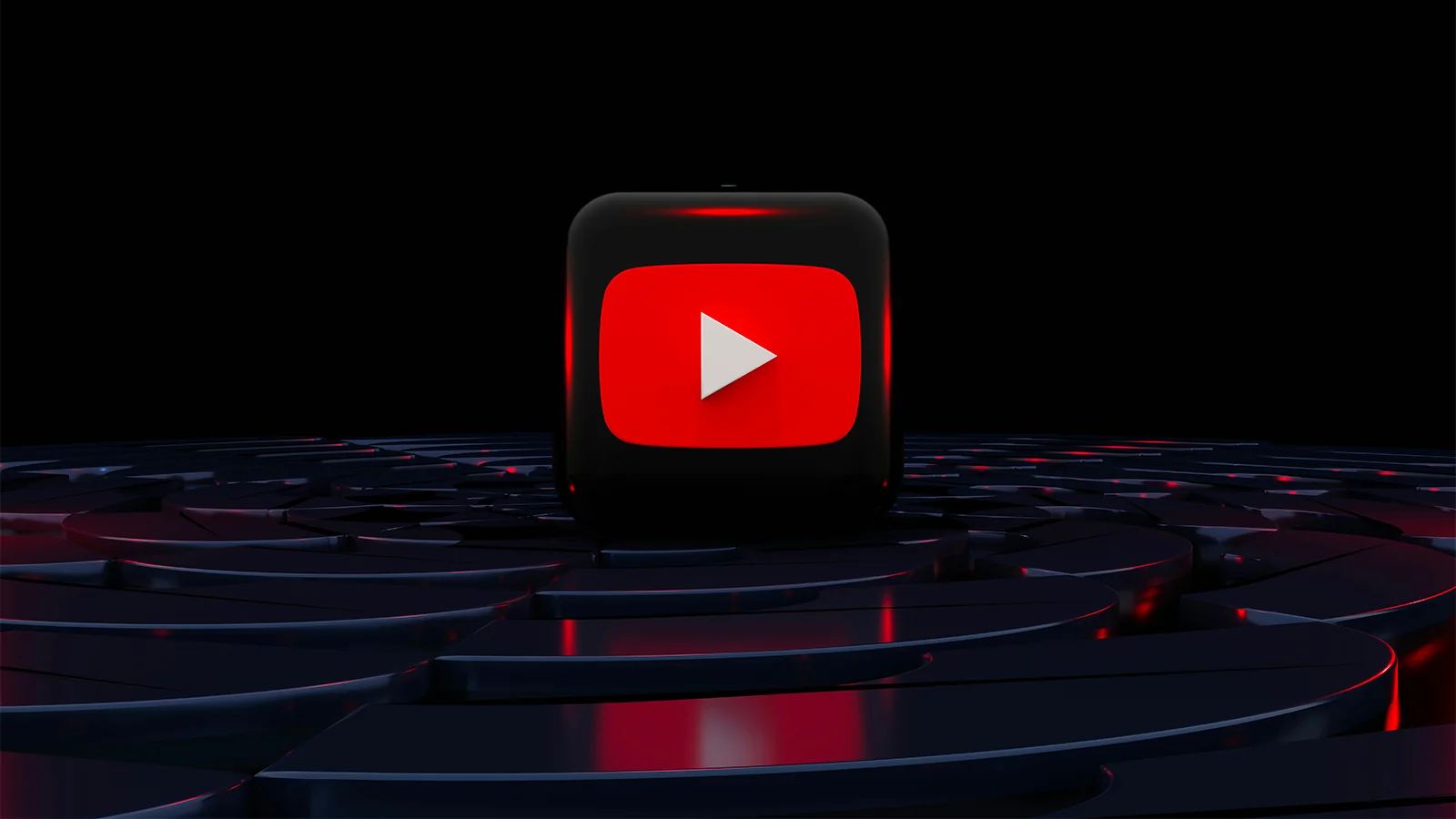
The new red is not about red
The most-covered change in the refresh, namely the shift from pure red to a slightly cooler red plus a new red-to-magenta gradient, is also the most misunderstood. Almost every news outlet framed it as a colour update. It is not a colour update. It is a hardware update.
Google Design's own write-up is unusually direct about this: the previous shade of pure RGB red was causing visible burn-in on a growing share of OLED TV screens, where YouTube is now consumed for hours per session. A cooler, slightly desaturated red eliminates that artifact. The new colour is, primarily, a fix for a hardware constraint that grew as the platform's TV viewership grew. The aesthetic improvement is the side effect, not the goal.
The red-to-magenta gradient is more interesting because it carries a piece of brand strategy in its construction. The gradient runs at a 45-degree angle with magenta on the right side, signifying, per the design team, forward movement. Magenta itself was chosen for its associations with imagination and evolution. None of this is decoration. It's a deliberate visual claim about where the brand sees itself going. Tubefilter's January 21 analysis noted that the gradient appears on the video progress bar, the Like and Subscribe buttons, the Premium badge and the Live ring, exactly the touchpoints where YouTube wants to associate itself with creator momentum rather than passive consumption.
Founders building their first brand should take this seriously. Every colour choice in your identity is an answer to a constraint or a strategic claim. If you can't articulate which one, the choice is decoration, and decoration always loses to a system.
How does this scale across an ecosystem?
The hardest part of any rebrand at YouTube's scale is not designing one beautiful logo. It is designing a system flexible enough to live across a sprawling ecosystem without fragmenting. PRINT Magazine's deep dive on the refresh emphasises this exact point: the 2026 system treats Shorts, Music, TV, Premium and Kids as variations of a single visual language, not as five different brands wearing the same parent logo.
Concretely, this means each sub-brand inherits the type system, the motion grammar, the colour gradient and the illustration framework, but tunes them to its own context. Music skews more chromatic and gestural. TV leans on calmer typography hierarchies for living-room consumption. Kids uses the illustration framework heavily; Premium uses it almost not at all. The shared layer is the system. The variable layer is the application.
That distinction between system layer and application layer is the architectural insight every founder should internalise. Most early-stage brands die at the application layer. They commission a beautiful logo, then have no rules for how the logo behaves on Instagram, in a pitch deck, on a packaging label, in a 60-second motion ad. The 2026 YouTube refresh is the cleanest current example of how to think about the layers separately. The system constrains. The application interprets. Neither one works without the other.
The play button stays, and that matters
Here is the quiet decision that almost no commentary has highlighted, and which, in my view, is the most professionally mature choice in the entire refresh. Tubefilter framed it as a question: "is it time to say goodbye to the play button?" YouTube's answer was an emphatic no. The triangular play button, arguably the most recognised single graphic element on the consumer internet, was untouched.
That restraint is the counter-argument to most rebranding instincts. There is enormous internal pressure during a refresh to "make it new." Designers want to leave a mark. Executives want to justify the budget. Marketers want a launch story. The hardest professional decision in any rebrand is the decision to leave equity alone. Equity is the visual capital your brand has spent years building in customers' visual memory. Burning it for novelty is the most common failure mode of high-profile rebrands.
The 2026 refresh kept the play button, the red-white-black core palette, the recognisable UI cues and the cultural shorthand of "like, subscribe, share." Everything new was layered around those anchors, not on top of them. That's a discipline borrowed from architecture more than from design: you renovate around the load-bearing walls. You don't remove them to prove you can.
There is a counter-argument worth taking seriously. By keeping so much of the existing identity intact, YouTube limits how much the refresh can communicate. A bolder visual break would have signalled "we're a different platform now" with more force. Some critics have pointed out that the changes are subtle enough that the average viewer will not consciously notice the new typeface, the new motion language or the gradient. They will just feel a vague sense that YouTube looks "slightly different." That risk is real. But the alternative (a Jaguar-style rupture that alienates the existing audience for the sake of theoretical new ones) has a track record of damaging brands. YouTube chose the conservative bet, and at this scale, conservative usually wins.
What should brand founders learn from this refresh?
The 2026 refresh is a masterclass in restraint at scale. YouTube did not chase a trend. It did not commission a celebrity studio for shock value. It did not abandon its equity. Every move was structural: a typeface that builds on the logo geometry, a motion identity drawn from real content, a colour adjustment driven by hardware constraints, a sub-brand architecture that distinguishes system from application. None of those decisions look spectacular in isolation. Together, they form the most coherent platform identity in the streaming category.
For founders building their first brand or planning their first refresh, the takeaway is uncomfortable: most rebranding effort is spent on the wrong layer. Founders agonise over the logo and pay an agency for a polished mark, then have nothing in place for how the brand actually lives: typography rules, motion behaviours, colour logic across mediums, sub-brand variants. The result is a beautiful logo on a fragmented system. The 2026 YouTube refresh is the inverse argument. Most of the budget went into the layers nobody talks about (typeface engineering, motion principles, illustration grammar, ecosystem cohesion), and the public-facing changes are deliberately quiet. This is also the principle behind every system we build for our own clients at pipopstudio: the deliverable is not the logo, the deliverable is the rules that make the logo behave.
My prediction: within 18 months, the way design conferences talk about YouTube's 2026 refresh will shift. The early coverage focused on the gradient. By late 2026, the case studies will focus on the system architecture. By 2027, design schools will be teaching "the layer logic" (system versus application) using YouTube as the canonical reference. The refresh itself will look obvious in hindsight, which is the highest compliment you can pay a system that was designed to last another two decades.
If you're planning your own brand work this year and you come away from this article with one thing, let it be this: stop optimising the logo. Start designing the rules. The brands that survive the next decade will be the ones that built a system instead of an aesthetic.
Sources
- Marketing Dive: YouTube revamps visual identity amid shifting entertainment landscape (January 21, 2026)
- Ad Age: YouTube unveils global visual refresh, including its first motion identity (January 21, 2026)
- ALM Corp: YouTube Unveils First Motion Identity System in Major Visual Brand Refresh for 2026 (January 2026)
- Sharp Type: YouTube Display case study (January 2026)
- Google Design: YouTube's New Red: A Colorful Rebrand (January 2026)
- Tubefilter: As YouTube refreshes its look, is it time to say goodbye to the play button? (January 21, 2026)
- PRINT Magazine: YouTube at 20: Designing a Brand That Lives With Culture (January 2026)