
A sports nutrition pack has to work at three in the morning, at kilometre 140, under a headlamp, held by someone whose hands are cold and whose judgment is not at its best. That is the real test, and almost no branding brief mentions it. Most briefs talk about standing out on a shelf. The shelf is where the product is bought. The headlamp is where the brand is either trusted or abandoned.
We build brands in this category, so this is the piece we wish existed when a founder emails us about a gel, a drink mix or a bar. What follows is what actually decides whether a sports nutrition brand earns trust: the constraints nobody warns you about, what an endurance athlete genuinely reads, and the mistakes that look like design decisions and are really strategy failures.
Why is sports nutrition one of the hardest categories to brand?
Because you are asking a stranger to put your product inside their body during the most important six hours of their year. Trust is not a nice-to-have in this category, it is the product. And the category is crowded with brands that have spent a decade earning it.
The money is real and so is the competition. Mordor Intelligence valued the European sports nutrition market at 6.61 billion dollars for 2026 in a report dated July 30, 2026, growing at 7.85 percent a year toward 9.64 billion by 2031. The United Kingdom holds about a third of it. Germany is growing fastest. Online retail accounts for more than half of sales, which means most of your packaging will first be seen at 400 pixels wide, on a phone, next to four competitors.
Three constraints stack on top of each other here, and they rarely stack in other categories. The label is legally restricted. The product is consumed under physical stress. And the buyer is an expert who reads ingredient lists for entertainment. Design that ignores any one of the three produces a brand that looks good in a portfolio and dies in a feed zone.
The label is a legal document before it is a design
In Europe, what you may claim on a pack is governed by Regulation (EC) No 1924/2006 on nutrition and health claims. The principle is simple and severe: a claim has to already sit on an authorised list, or be individually approved, before it can appear anywhere. Not just on the pack. On the site, in the ad, in the caption.
Two consequences follow that most creative teams discover too late. Foods and supplements cannot be presented as preventing or treating anything, so the entire vocabulary of medicine is closed to you. And an authorised claim usually comes with a compositional condition attached, which means the copywriting and the formulation have to be decided together. You cannot write the line and then ask the lab to make it true.
The regulatory picture is also still moving. NutraIngredients reported on January 7, 2026 that the Commission remains under pressure to finalise harmonised maximum levels for vitamins and minerals, and that nutrient profiles, written into the 2006 text, have still never been formally adopted. A brand built on a claim that a future harmonisation could invalidate is a brand with a redesign already scheduled.
So the first deliverable in this category is not a moodboard. It is a claims map: what you are legally allowed to say, what your formulation actually earns you, and what you will therefore communicate through design rather than through words. That last column is where the brand gets built, because it is the only column your competitors cannot copy from the register.
What does an endurance athlete actually read on a pack?
Four things, in this order, and none of them is your logo.
- Format and dose. How much is in here, and is it one serving or two? Innova Market Insights found on June 29, 2026 that over 30 percent of European consumers now favour resealable and portion-controlled packs, valuing usability and precision.
- Carbohydrate and sodium figures. The two numbers an endurance athlete compares across brands. If they are hard to find, you have communicated something about your confidence.
- Ingredient list length. Short reads as clean. Long reads as hiding something, fairly or not.
- Flavour. Last, and it matters more than anyone admits, because after four hours most flavours become unbearable.
The use context deserves its own thought. Innova also found that a quarter of European consumers use sports nutrition for outdoor exercise. Outdoors means gloves, sweat, rain, one hand on a bar. It means a tear notch that works when wet and a cap that stays attached to the pouch, which the industry moved to partly for litter reasons and partly because a dropped cap at kilometre 90 is a small betrayal.
Design for that and the pack becomes an argument for the brand. Design for the shelf alone and you get a beautiful object that people quietly stop buying after the first race.
Starting from zero against Maurten and SiS
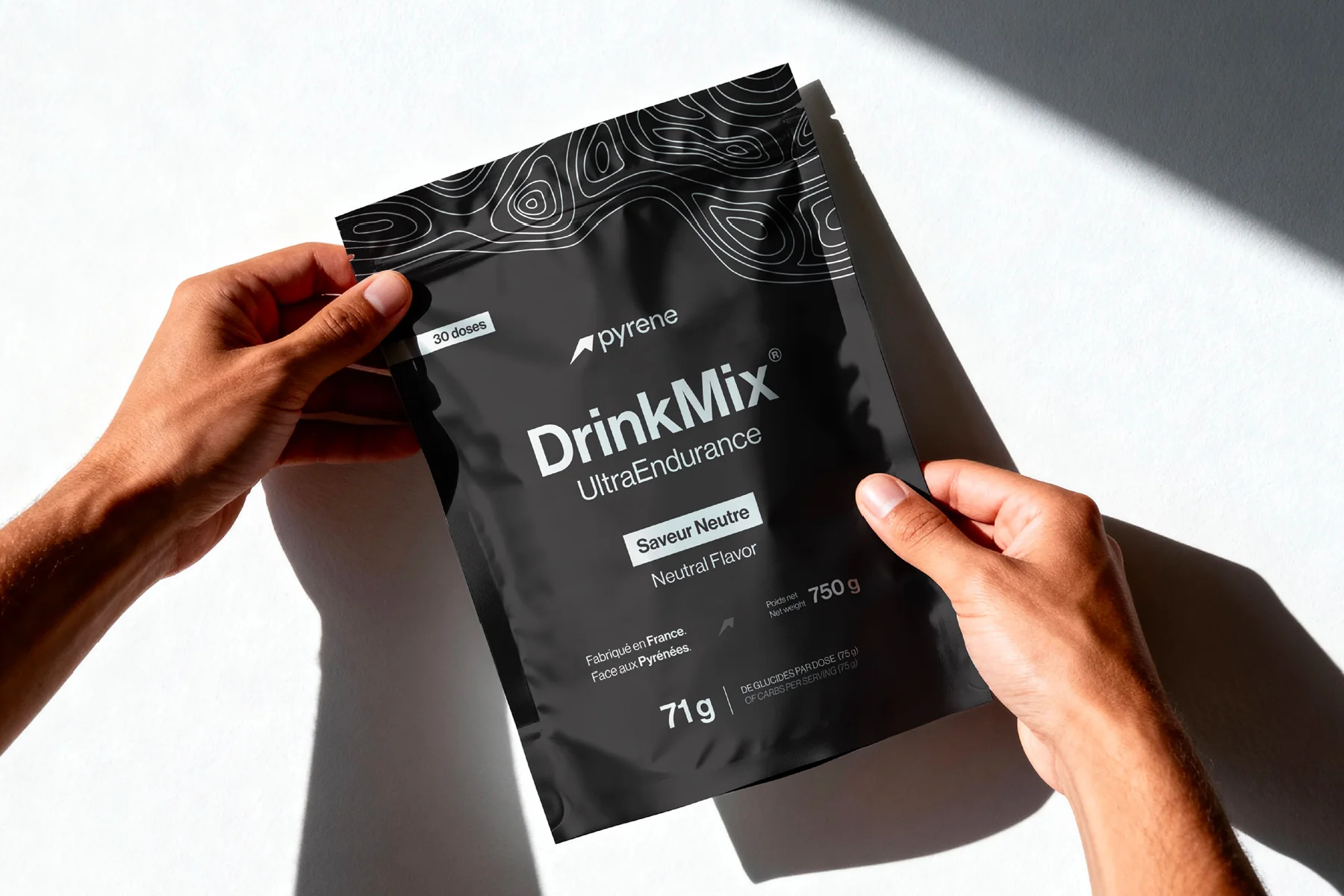
This is the brief we took on with Pyrene Performance, a French sports nutrition brand out of Toulouse. Two lifelong athletes, running, cycling and adventure racing, tired of products that were poorly tolerated and sold with opaque ingredient lists, decided to build their own. They had a conviction and a blank page.
The challenge was stated honestly from the first meeting: zero brand equity in a market held by Maurten, SiS, Näak and Tailwind, brands that had spent years earning trust. Pyrene had to show up on day one with the stature of an established name, and hold it on a shelf, on a start line and under that headlamp.
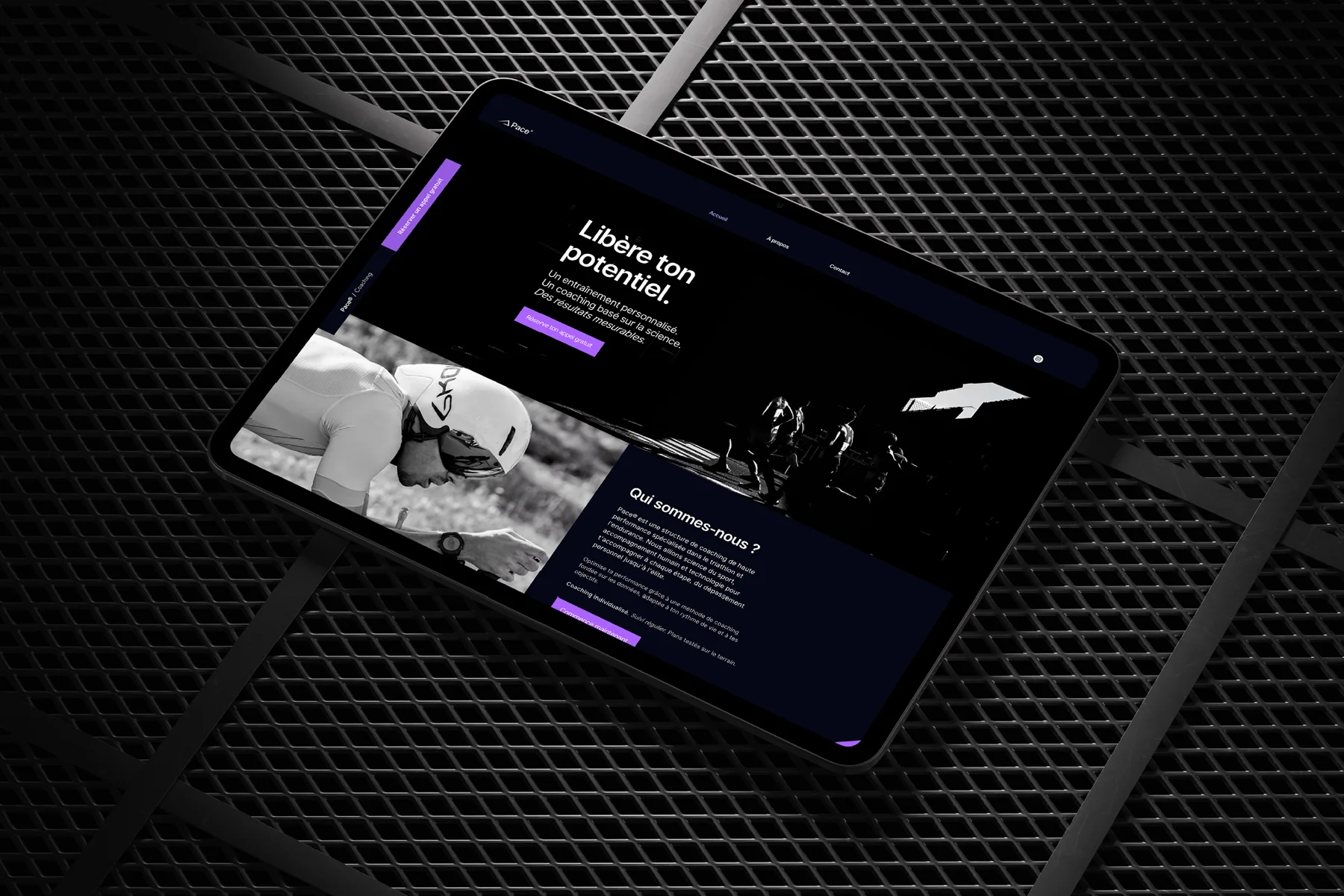
What made it work was refusing the usual either/or. Sports nutrition brands tend to pick a side: clinical, which reads credible but cold, or outdoors, which reads warm but amateur. We built a double reading instead, mountain and laboratory, carried through every touchpoint. The icon is constructed on the golden ratio and the Fibonacci spiral, which is not decoration, it is the same claim the brand makes verbally: this is rigour, applied to nature. The full case study shows how it runs from packaging to the Shopify store.
The transferable lesson is not the mountain. It is that a new brand in a trust category needs a visible reason to be believed on day one, before any athlete has tried the product. Rigour has to be legible in the form itself, because there is no track record to point at yet.
How do you look credible without looking clinical?
Credibility in this category comes from precision, not from the colour white. A grid that holds. Numbers set in a typeface that respects them, aligned, tabular, easy to compare. Consistent unit treatment across a range so a customer can read two products side by side without doing arithmetic. That is what signals a company that measures things.
Warmth then comes from everything the regulation does not touch: photography that shows the actual conditions rather than a finish-line stock shot, a tone of voice that talks to athletes as peers, and a colour system built around use rather than flavour. That last one is the most common quiet mistake, and it deserves its own paragraph.
Most ranges colour-code by flavour, which means the system breaks the moment marketing adds a fifth flavour and the palette runs out of distinguishable colours. Code by function instead, energy, hydration, recovery, and flavour becomes a secondary signal inside each family. The range then scales to twelve products without a redesign. This is the same argument we made about packaging systems in the Great Value redesign: the system has to survive the product roadmap.
Product naming follows the same logic and is worth deciding early. Invented names give you trademark room and no meaning, so every one of them costs a line of explanation on the pack and in the ad. Functional names give you instant clarity and almost no protection, and they age badly when the range grows. The workable middle is a functional family name carrying a short coded variant, which lets an athlete say what they want at a feed station in three syllables. If a customer cannot order your product out loud without describing it, the naming has failed regardless of how it looks set in the typeface.
Which mistakes kill a sports nutrition brand?
Four, and we see them in that order.
- Claim creep. A founder writes the packaging copy, an authorised claim gets stretched by one adjective, and a distributor's compliance team rejects the whole run. Rewriting a pack after print is the most expensive typo in the industry.
- Designing for the shelf and not the phone. With more than half of European sales happening online, the pack has to survive being a thumbnail. If the product name is unreadable at 400 pixels, it does not exist.
- Athlete photography that could belong to anyone. The suffering face, the wet asphalt, the sunrise. Every competitor has the same library. Specificity is the only defence: your place, your terrain, your athletes.
- Treating the range as a set of products rather than a system. Brands that design pack by pack end up with a shelf that looks like four different companies, which is exactly the impression a serious athlete uses to disqualify you.
Behind all four sits the same failure. The brand was treated as a surface applied at the end rather than a set of rules decided at the beginning. That is the argument of our piece on what actually happens inside a brand identity redesign, and it applies with force here, because in nutrition the rules include a regulator.
What to do before you design a single pouch
Three things, and they cost nothing but honesty.
- Write the claims map with whoever formulates the product. Three columns: what the register authorises, what your formulation earns, what you will therefore say with design instead of words.
- Choose the one use occasion you are built for, and name it in a sentence. Long-distance efforts above four hours is a brand. General wellness is a category with no edges and forty competitors.
- Test the pack in the actual conditions before you approve it. Print a mockup, put it in a jersey pocket, open it with cold wet hands, read it at 400 pixels on a phone. Every serious flaw shows up in that ten-minute test, and it is the test nobody runs.
FoodNavigator's read on the sector for 2026, published on December 4, 2025, is that the category keeps widening as everyday fitness pulls it out of pure performance. That widening is an opportunity and a trap. It brings new buyers who do not read carbohydrate figures, and it tempts brands into softening the very precision that made athletes trust them. Take the new audience without spending the credibility.
If you are building in this category, the work starts with the rules and not the pack. That is what our brand identity practice is organised around, and in sports nutrition the rules are half design and half regulation. Get them written down and the packs, the site and the campaign follow from one source. Get them wrong and you will be redesigning after the first compliance review, which is a bad time to discover what your brand is about.
Sources
- Mordor Intelligence: Europe Sports Nutrition Market, size and growth analysis (July 30, 2026)
- Innova Market Insights: Sports Nutrition Trends in Europe, consumer insights (June 29, 2026)
- NutraIngredients: European supplement regulations to watch in 2026 (January 7, 2026)
- FoodNavigator: Top 6 driving the sports nutrition sector in 2026 (December 4, 2025)
- European Commission: Nutrition and health claims, Regulation (EC) No 1924/2006 (in force since 2007, consulted September 2026)