
Most founders know they need a new identity about a year before they say it out loud. The logo still works, technically. The website still converts, sort of. But they have started apologising for the deck before they open it, and they send the PDF instead of the link. That apology is the real brief, and it never appears in the email that asks for a quote.
This piece is the answer we give when someone asks what actually happens inside a brand identity redesign. Not the theory. The order of operations, the parts that take longer than anyone expects, what lands in your hands at the end, and the cases where the honest answer is to change nothing at all.
What actually happens in a brand identity redesign?
Five phases, in this order: audit, strategy, visual identity, application, launch. The industry consensus on their length is remarkably tight. Letus Brandworks, writing on August 10, 2026, breaks it down as one to two weeks of audit, two to four of strategy, four to eight of visual identity, four to eight of application and one to two of launch. Our own numbers land within a week of that, which tells you the shape of the work is not a matter of taste.
What varies is where the weight sits. A studio that sells logos spends its time in phase three. A studio that sells systems spends it in phases one and four, because that is where the decisions that outlive the project get made. The middle phase is the visible one, so clients assume it is the expensive one. It rarely is.
The phases also overlap in one specific way that matters. The name, if a name is changing, has to start in phase one, because trademark clearance runs on its own clock and answers to nobody's deadline. Every timeline below assumes the name is not moving. If it is, add a month and stop planning the launch.
Phase one is listening, and it runs longer than the client expects
The audit is not a slide of competitor logos. It is a week of reading everything the company has ever put in front of a customer, plus a set of conversations with the people who use those things daily. Sales decks. Invoices. The Instagram grid. The email signature nobody approved. The three versions of the logo circulating in different departments, which is how you learn what the brand has actually become while nobody was governing it.
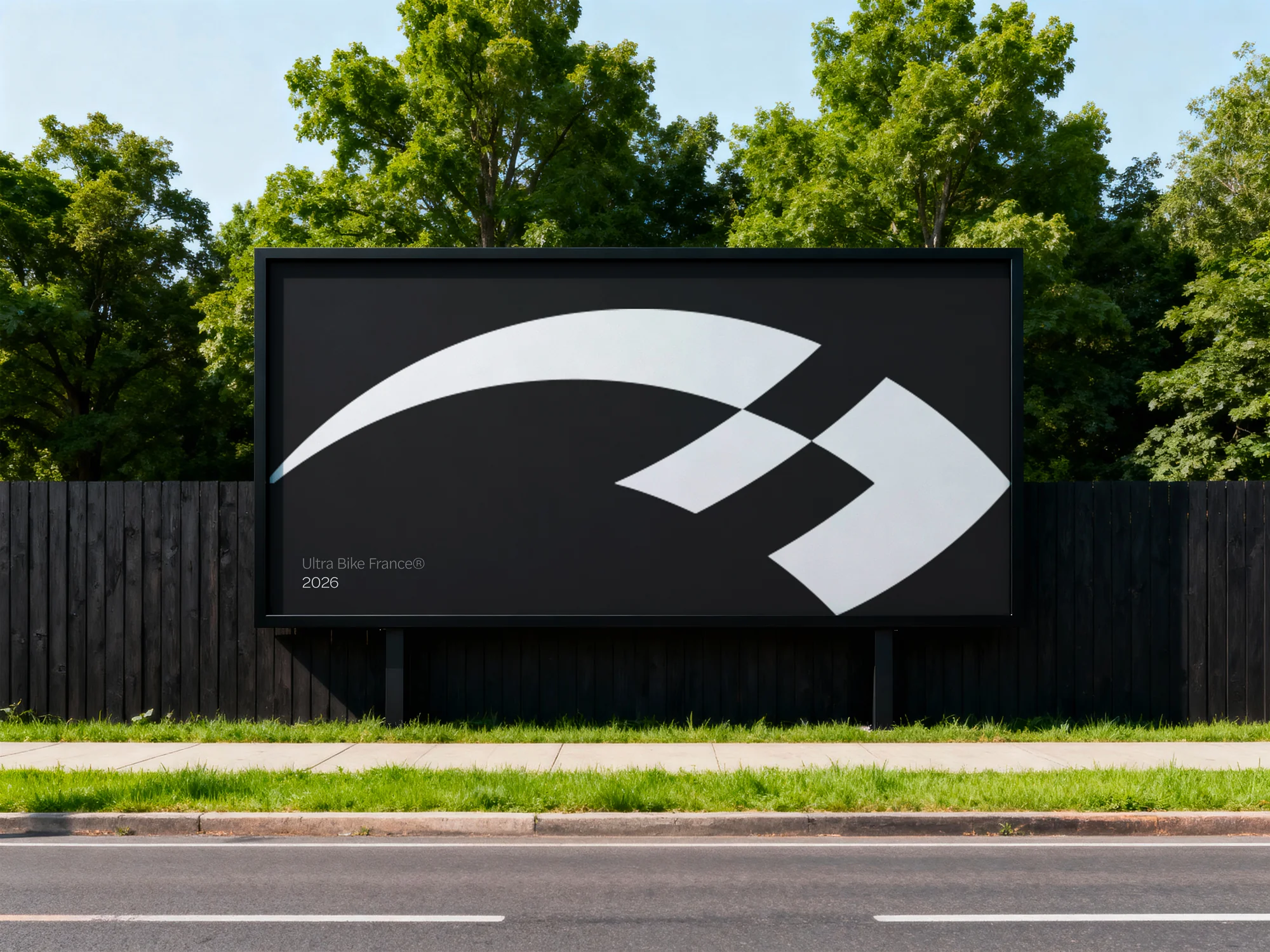
We ran that process for Ultra Bike France, a French ultra-cycling event series that had plateaued after four years. Fifteen competing events went through a full audit before we touched a single pixel. The finding that reframed the whole project was not visual. The brand spoke to the ten percent of specialists and ignored the ninety percent of curious challengers who could become riders. Every design decision after that followed from one sentence, and the rebrand that came out of it turned a niche technical event into an adventure platform.
You cannot shortcut this phase with a questionnaire, and the reason is uncomfortable. Founders describe the brand they intended, not the one that exists. The gap between those two is the project. A studio that skips the audit is designing for the intended brand, which is why so many redesigns feel correct in the deck and wrong in the world.
What does the strategy phase actually produce?
A page. Sometimes less. Everything that follows has to be derivable from it, and if it takes twenty slides to explain, the strategy has not happened yet, the research has.
What goes on that page: who the brand is for, stated narrowly enough to exclude someone. What it competes against, which is often not the obvious rival but the customer's habit of doing nothing. The one quality it will be recognised for, and the two adjacent qualities it is deliberately giving up, because a brand that claims warmth and rigour and speed and value claims nothing. Then the sentence, written the way a customer would say it out loud.
This is the phase clients try to skip, and I understand why. It produces no images. It feels like paying for a conversation. But it is the only artefact in the project that can be tested cheaply: read the page to five people who match the target and watch which line they stumble on. Fixing a wrong sentence in week three costs an afternoon. Discovering it in week fourteen, after the packaging is printed, costs the project.
It is also the document that tells you whether the designer understood. When we present visual work, we present it against that page, one claim at a time. If a colour cannot be traced back to a line on the page, it is decoration, and decoration is the first thing a new marketing director deletes.
How long does a brand identity redesign take?
Between six weeks and a year, and the range is that wide because the word covers four different projects.
- Visual refresh: six to ten weeks. The positioning is right, the execution is dated. Type, colour, layout, applied to what already exists.
- Full rebrand without a name change: fourteen to twenty-two weeks. New positioning, new system, new applications.
- Full rebrand with a name change: eighteen to twenty-eight weeks, because trademark clearance sits in the middle of it.
- Multi-market or enterprise: six to twelve months, and the extra time is coordination, not design.
Those brackets come from Letus Brandworks and match what we see. The thing worth knowing is what actually causes overrun, because it is almost never the design. It is feedback latency, undefined decision-makers and scope that grows in week seven. A client who answers within two days and names one final decision-maker on day one will finish a full rebrand in fourteen weeks. The same project with five stakeholders and a weekly reply cycle takes twenty-two, and the design work inside it is identical.
So when we scope, we ask two questions before we ask about aesthetics. Who signs off, and how fast can you look at things? The answers move the timeline more than anything in the creative brief.
The audit is where the money gets saved
Every hour in phase one removes several in phase three. A studio that knows exactly what the brand is for stops producing options nobody wants. The dirty secret of the three-route presentation is that two of the routes exist because the studio did not know enough to commit. Presenting three directions is not generosity, it is hedging, and the client pays for the hedge in revision rounds.
We present one direction with the reasoning visible, and a second only when a genuine strategic fork exists, which is rare. That is only possible because phase one did its job. It also changes the conversation in the room: the discussion stops being about preference and starts being about whether the reasoning holds, which is a discussion a founder can actually win or lose on evidence.
The other saving is in application. Most of the cost of a redesign is not the identity, it is everything that has to be remade because the identity changed. Decide the system early enough and phase four is assembly. Decide it late and phase four is invention, five times over, under deadline.
What does a studio actually hand over?
Files, obviously. But the deliverable that determines whether the work survives is the rule set: what the type does at each size, how much space the mark needs, which colour carries meaning and which is decoration, what the brand sounds like when it apologises. A logo is a decision. A system is a set of decisions that lets other people make more decisions correctly without calling you.
That distinction has become sharper this year, because the audience for the rule set changed. Frontify reported on June 23, 2026 that 95 percent of companies have brand guidelines and 81 percent still struggle with off-brand content, and that 85 percent of marketers now use AI tools to make things. Their conclusion is blunt: a PDF cannot convey semantic meaning. A machine can find the word blue in your brand book and cannot tell that it is the primary colour.
"Brand teams should not have to become data migration teams to make their brands AI-ready."
Which is why we now write the rules as structured tokens as well as prose, an approach the MindStudio team laid out for design tokens and agents in June 2026 and Matchstic argued for again in August. It is the same argument we made about software moving to the kitchen table: your own team will build forty small things this year, and most of them will be built with an agent that has never read a PDF. The brand book used to be for agencies. Now it is for everyone in the building with a prompt.
When should you not redesign your identity?
When the problem is the product, and the identity is getting blamed. This is the most common case we turn down. A brand that looks dated and sells well has a taste problem, which costs a refresh. A brand that looks beautiful and does not sell has a positioning problem, which no amount of type will fix.
The criteria are reasonably settled. Fortress, writing on July 15, 2026, puts a full rebrand on the table for a genuine change of market, a legacy reputation to overcome, a shift in what you actually sell, persistent buyer confusion or a merger. Everything else, dated visuals, internal inconsistency, a site that converts worse than a competitor's, is refresh territory. That list is worth reading before you brief anyone, because those two projects differ by three months and by an order of magnitude in disruption.
There is a third case, and it is the one nobody sells you. Sometimes the identity is fine and the enforcement is absent. If three versions of your logo are in circulation and your team writes in four voices, a redesign will produce a fourth logo and a fifth voice. What that company needs is governance: one file, one owner, one place people actually look. It costs a fraction of a rebrand and fixes the symptom that made everyone want one.
What to do before you brief anyone
Three things, and they take an afternoon.
- Collect every artefact your brand has produced in the last year, in one folder. The deck, the invoice, the packaging, the two logos. Look at it as a stranger would. That folder is your audit's first hour and it will tell you whether you need a refresh or a rebrand.
- Write the sentence you want a customer to say about you to a colleague. Not a tagline. The actual sentence. If you cannot write it, that is the strategy phase, and no visual work should start before it exists.
- Name one final decision-maker and commit to a two-day feedback rhythm. This single choice is worth more weeks than any brief.
Then look at how a studio scopes the work before you look at its portfolio. Portfolios show taste, which is easy to fake with a good photographer. Scope shows judgment. Ours is laid out in detail on our brand identity page, phase by phase, so you can compare it against whoever else you are talking to.
A redesign is not a new coat of paint on the same building. It is the moment a company decides, on purpose and in public, what it is going to be recognised for. The design is the visible half. The other half is a set of rules that lets everyone who works there make that decision again, correctly, on a Tuesday afternoon, without asking anyone. Get that half right and the identity outlives the trend that inspired it. We wrote about identities that adapt rather than freeze for exactly this reason.
Sources
- Letus Brandworks: How Long Does a Rebrand Take, a Realistic Timeline by Scope (August 10, 2026)
- Fortress: Rebrand vs. Brand Refresh, Which Strategy Does Your Company Need in 2026 (July 15, 2026)
- Frontify: The future of brand governance is machine-readable (June 23, 2026)
- MindStudio: How to Use Design Tokens with AI Agents (June 2026)
- Matchstic: Your Brand Now Has a Second Audience, The AI Machines (August 2026)