Your logo is a single note. Your brand needs a symphony.
Here's something I still see every week: a founder sends over their brand assets and it's one PNG file. One logo, one colour, one font. As if their entire identity could be zipped into a folder the size of a holiday photo. In 2006, that was fine. In 2026, it's a slow-motion disappearance.
The brands winning right now, the ones getting cited by AI assistants, shared on Reels, and instantly recognised at 16×16 pixels, aren't the ones with the best-looking logo. They're the ones with the best adaptive brand identity system: a visual infrastructure that shapeshifts across every platform, format, and context without ever losing its signature.
This isn't a theoretical shift. It's already measurable. According to Lippincott's research on AI-driven brand discovery, 71.5% of consumers now regularly use tools like ChatGPT and Perplexity for brand discovery, and those tools don't care about your Pantone swatch. They care about signal consistency, structured data, and whether your brand shows up coherently across 50 different touchpoints. A single static logo generates almost nothing for an AI agent to work with.
What actually makes a brand identity "adaptive"?
Think of it like architecture versus furniture. A static logo is a chair, beautiful, maybe, but fixed. An adaptive identity is an architectural system: walls that can move, lighting that responds to daylight, spaces that reconfigure for different uses while always feeling like the same building.
In practical terms, an adaptive brand identity includes:
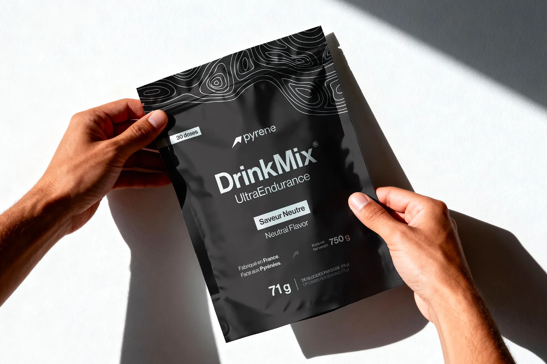
- A modular logo family, not one mark, but a constellation: full wordmark, compact icon, animated signature, monochrome fallback. Each variant has clear usage rules, so a team in Tokyo and a team in São Paulo can both execute without the brand drifting.
- Contextual colour systems, variable palettes that shift for dark mode, print, social feeds, and packaging. Not rigid RGB values, but a colour mood that remains recognisable even when the exact palette changes.
- Responsive typography, type that adapts across screen sizes, reading contexts, and emotional registers. The same typeface used at 120pt on a hero banner and 14px in body copy needs to serve completely different purposes.
- Motion principles, how the brand enters, transitions, and exits. Envato's 2026 branding trends report calls kinetic logos one of the year's most significant developments, and for good reason: on motion-first platforms, a brand that doesn't move is a brand that doesn't exist.
- Sensory extensions, sonic branding, tactile finishes for packaging, even scent cues. The identity lives beyond the screen.
I sometimes explain it to clients this way: a great identity system is like a jazz musician who can play a wedding, a concert hall, and a late-night club, always themselves, never the same set twice.
What's changed in 2026 is the number of stages. Five years ago, a brand needed to work on a website, business cards, and social profiles. Today it needs to work inside AI chat interfaces, AR overlays, wearable screens, voice-activated dashboards, and formats that haven't been invented yet. The brands building rigid identities are building for a world that no longer exists.
The Jaguar rebrand proved the old model is broken
On November 19, 2024, Jaguar dropped its iconic growler logo for a minimalist "JaGUar" wordmark, and the internet lost its mind. Elon Musk posted "Do you sell cars?" Thirty internal designers reportedly raised concerns that the new mark felt "too rounded and playful" for a luxury marque. Design Week's one-year retrospective calls it the most debated identity shift since Gap's infamous 2010 logo fiasco.
The backlash generated 1,300% more brand readership and nearly a billion impressions. Jaguar's managing director told Top Gear: "The old strategy didn't work commercially." And the numbers confirm it, the brand had essentially wound down all legacy production before the rebrand even launched, preparing for an all-electric rollout in late 2026.
But here's the part most design commentary misses: the real question was never "is the new logo good?" The real question is whether a heritage brand can survive by staying still. And Jaguar answered that with a definitive no. Whether you love the execution or hate it, Jaguar understood something most brands still refuse to accept, a static identity built for the petrol era cannot carry a company into the electric one. The problem wasn't the change. It was how long they waited.
Compare this to how most European mid-market brands approach identity updates: a careful refinement every 7-10 years, preserving every heritage element, treating the logo like a family crest. There's wisdom in that, but it only works if the market beneath you isn't shifting. When your entire product category, distribution model, and customer base change simultaneously, incremental refinement becomes a recipe for irrelevance.
Why are AI agents the new gatekeepers of brand visibility?
This is the part that should make every brand strategist uncomfortable. Lippincott's 12 trends for 2026 identifies a fundamental shift: AI-generated overviews now intercept traffic before users even reach your website. The consumer doesn't discover you anymore. An AI agent does, and then decides whether to recommend you or skip you.
What does this mean for brand identity? Everything. A flexible identity system generates richer, more consistent signals across the web, structured data, consistent visual presence, coherent metadata, that AI agents can parse and trust. A single static PNG on your About page gives them almost nothing.
Consider how an AI agent evaluates two competing brands. Brand A has one logo on its website, no schema markup, inconsistent naming across directories, and no motion assets. Brand B has a modular identity system, structured brand data on every page, consistent visual signals across 40 platforms, and a motion signature that appears in video content. When a user asks "recommend a branding studio for my startup," which brand do you think the AI will surface? The one it can barely parse, or the one that speaks its language?
This is the uncomfortable truth about modern brand strategy: you're no longer designing just for human perception. You're designing for algorithmic legibility. And that requires systems, not static marks.
We explored the strategic implications of this shift in our piece on authority-first marketing. The short version: your brand needs to be not just visible but machine-readable. And a modular identity system, with clear naming, consistent usage, and structured brand data, is the foundation.
Your brand is what sets you apart in AI-powered discovery. Not your ad budget. Not your follower count. Your consistency, your structure, your coherence across every touchpoint an algorithm can scan.
How do you actually build a system that flexes without breaking?
At pipopstudio, we start every identity project with the system architecture, not the logo. The logo is one component, often the last one we lock. Here's the framework we follow:
- Audit the contexts first. Before sketching anything, we map every context the identity will need to live in: app icons, social avatars, email signatures, packaging labels, event signage, video intros, investor decks, dark mode interfaces. The contexts dictate the system's constraints.
- Design the rules, then the marks. We define spacing, proportions, clearance zones, and colour logic before committing to any single visual. The rules ensure that anyone, from a freelance social media manager in Toulouse to a co-founder pitching in Berlin, can execute the brand without supervision.
- Build motion from day one. Every identity we deliver includes motion principles: how the logo appears (fade, build, reveal), how it transitions between states, and how it exits. Even if a client doesn't need animation today, the principles are embedded in the brand book so they're ready when motion becomes necessary.
- Stress-test aggressively. We render the identity across 20+ real contexts before delivery. Favicon at 16×16, Instagram story overlay, large-format print at 3 meters. If it breaks anywhere, we fix the system, not patch the individual context.
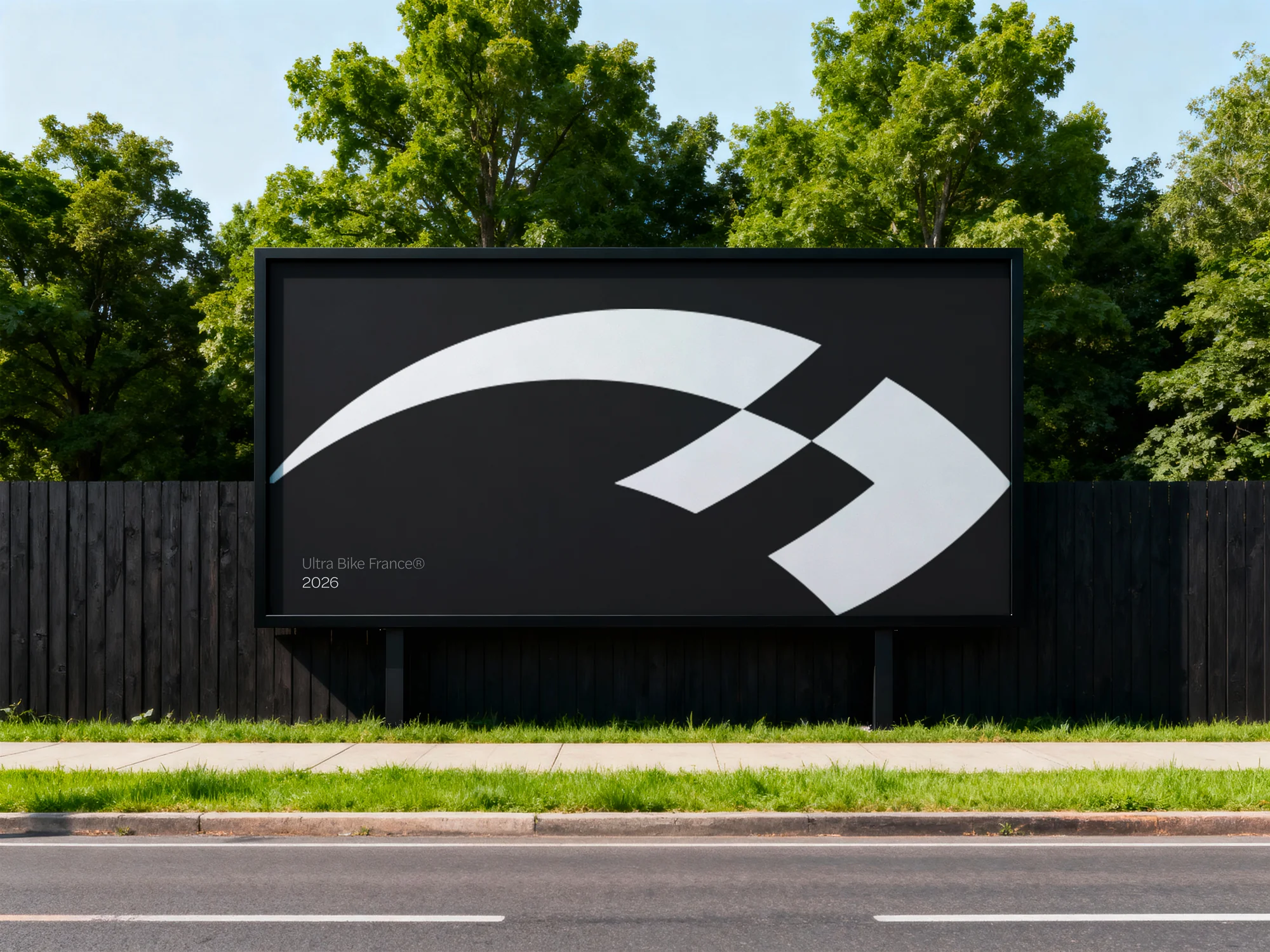
When we rebranded Ultra Bike France, the identity had to work across race bibs, GPS tracking apps, Framer websites, and social feeds competing with hundreds of cycling events. After four years, growth had plateaued, the brand spoke to the 10% of specialists and ignored the 90% of curious challengers. We ran a full audit of 15 competing events before touching a single pixel. The new system turned a niche technical event into an adventure platform with a visual language that finally matched the experience riders were already having.
The counter-argument: when does flexibility become incoherence?
Let me be honest about the risk. Adaptive identity has a failure mode, and I've seen it up close: a system so flexible that nobody remembers what the brand looks like. Twelve logo variants, six colour palettes, three type families, and the result is visual noise, not visual identity.
The difference between flexibility and chaos comes down to hierarchy. A great adaptive system has one immovable anchor, usually a distinctive colour, a structural principle, or a motion signature, and everything else adapts around it. Netflix's flat red "N" doesn't change. The content, formatting, and context around it constantly shift. Spotify's green is non-negotiable; the illustration style, photography, and layout are endlessly reconfigured.
This parallels something we see in the imperfection trend: controlled variation only works when there's a recognisable core underneath. Imperfection without structure is just mess. Flexibility without hierarchy is just confusion.
The brands that get this wrong usually skip the strategy phase. They jump straight to "we need twelve logo variants" without first answering: what is the one thing that never changes?
There's also a timing risk. Adaptive systems cost more upfront than static identities, more variants to design, more rules to document, more testing to run. For a pre-seed startup with no product-market fit, that investment might be premature. But for any brand with customers, revenue, and a multi-channel presence, the question isn't whether to invest in an adaptive system. It's how much longer you can afford not to.
What should you do next week?
Pull up your brand assets right now. Ask four questions:
- Does your logo work as a 16×16 favicon, not "kind of," but clearly?
- Does it have a motion behaviour defined, even on paper?
- Does it adapt to dark mode without a designer manually adjusting it?
- If you asked ChatGPT to describe your brand's visual identity, could it, from publicly available signals alone?
If any answer is no, you don't need a rebrand. You need a system upgrade. The identity itself might be perfectly good, it just needs infrastructure around it. New variants, defined motion, contextual palettes, structured metadata.
The brands that will matter in 2027 aren't redesigning from scratch. They're engineering their existing identities to survive in an ecosystem of AI agents, micro-screens, and motion-first platforms.
The shift from static to adaptive isn't optional, it's already happening. The only question is whether you'll design the transition deliberately, or discover one morning that AI agents have simply stopped recommending you because your brand couldn't keep up.
Static is comfortable. Adaptive is inevitable.
Sources
- Lippincott — The Future of AI Search Is Brand-Led (2026)
- Lippincott — 12 Trends Set to Define 2026 (January 2026)
- Design Week — The Jaguar Rebrand One Year On (November 2025)
- Top Gear — Jaguar MD on Brand Reinvention (2025)
- Envato — Logo and Branding Trends for 2026: Kinetic Logos (January 2026)
- The Branding Journal — Top Branding & Design Trends for 2026 (January 2026)